What's new
Photoshop Gurus Forum

Welcome to Photoshop Gurus forum. Register a free account today to become a member! It's completely free. Once signed in, you'll enjoy an ad-free experience and be able to participate on this site by adding your own topics and posts, as well as connect with other members through your own private inbox!

Export As Different Colour from Main


BruceBanner

Member
Messages
8
Likes
1
I'm having an Exporting issue in both LR and PS. Curiously the Export As preview window in PS is already accurately showing the tone differences between what it is going to spit out vs what the main image in PS/LR shows. Easier for you to see from the screen grab provided. Essentially we're losing reds or magenta's, the flesh of the women is more rich (and her hair) compared to what Exporting from LR or Save As in PS or Export As in PS gives.

Things I've tried.
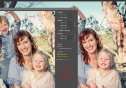
  • Confirmed working spaces are same, LR and PS are on the same page, both ProPhoto (LR and PS are not changing colours between applications, 'Edit In>PS' from LR for example is fine and PS is showing the same colour tones/image etc)
  • Tried toggling out of 16bit and into 8 bit in PS, no change, problem persists
  • Ensured exporting every way is using sRGB (LR as well), still persists
  • Tried changing PS to be sRGB and not ProPhoto, no change, issue persists.
  • Toggling Embed Color Profile, no change.
  • And tried a heap of other changes that I forget, but always the Export As is showing quite a strong difference to final image.
At this point I am at a loss as to why the Exporting is changing things...color.JPG

Any ideas?


Adobe Photoshop Version: 20.0.5 20190605.r.83 2019/06/05: 1206907 x64
Number of Launches: 728
Operating System: Windows 10 64-bit
Version: 10 or greater 10.0.18362.329
System architecture: Intel CPU Family:6, Model:14, Stepping:3 with MMX, SSE Integer, SSE FP, SSE2, SSE3, SSE4.1, SSE4.2, AVX, AVX2, HyperThreading
Physical processor count: 4
Logical processor count: 8
Processor speed: 2592 MHz
Built-in memory: 16273 MB
Free memory: 8932 MB
Memory available to Photoshop: 14887 MB
Memory used by Photoshop: 60 %
Alias Layers: Disabled.
Modifier Palette: Enabled.
Highbeam: Enabled.
Image tile size: 1024K
Image cache levels: 4
Font Preview: Medium
TextComposer: Latin
 
Hi BruceBanner (and please don't turn into the Hulk because of my comments ;) )

My first guess is that the image is still in ProPhoto RGB color space in spite of your efforts to make that change in PS.

ProPhoto RGB is an extremely wide color space and sRGB is very small. Out of gamut colors would be mapped to less saturated colors.

This can also be verified by using the soft proofing capability in LR or PS.

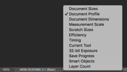
So the first thing I would do is go to the lower left corner of you image frame of PS and change the settings to view Document Profile. That would verify which color space you image actually has. See image on how to change.

If it is in sRGB as you indicated then there is a different issue and the debugging and forum help can continue.

John Wheeler

Screen Shot 2019-10-12 at 9.33.32 AM.png
 
Hi BruceBanner (and please don't turn into the Hulk because of my comments ;) )

My first guess is that the image is still in ProPhoto RGB color space in spite of your efforts to make that change in PS.

ProPhoto RGB is an extremely wide color space and sRGB is very small. Out of gamut colors would be mapped to less saturated colors.

This can also be verified by using the soft proofing capability in LR or PS.

So the first thing I would do is go to the lower left corner of you image frame of PS and change the settings to view Document Profile. That would verify which color space you image actually has. See image on how to change.

If it is in sRGB as you indicated then there is a different issue and the debugging and forum help can continue.

John Wheeler

View attachment 106971

Thanks for the replies! Like all good threads I think the answers here might be spawning further questions...

First off, in the screenshot above I was indeed still in ProPhoto RGB Color space, what I meant was that when I changed to sRGB the problem still seemed to persist in exactly the same manner as the screenshot shows above. What I tested (IIRC) was the following;

  • In PS I went to the Colour Settings and changed from ProPhoto to sRGB, then hit ok and exited.
  • In LR I went to the settings where it mentions External Editors and set PS to being sRGB there as well
  • I then did the LR>Edit In>PS with the file, which then seemed to look relatively no different in PS even though now we're in a different colour space
  • When bringing the Export As preview window up again (with these different changes) a significant and possibly the exact same tone was seen.
So I will try these other fixes that you and Preston have supplied and report back.

My new questions are this;

1) It sounds like there are a lot of recommendations to work in ProPhoto RGB 16bit (my files are RAW 14bits) for both LR and PS environments. However... if the professional work I do is to eventually end up with supplying my client with the best Jpg quality they can get... am I best to just never edit in ProPhoto in these environment, because what I am seeing in the applications is not what the client will end up getting, it's making me second guess my editing process now :S If I edit in a sRGB environment then at least what I am seeing is what the export is going to be like...?

2) With ProPhoto being better than sRGB, when I have gone to printing I have thus far just used the Print module with the RAW edited DNG file in LR. I'm guessing because I am printing that way that perhaps I am getting higher quality prints than if I exported my LR edits to sRGB Jpgs and then used some kind of separate Jpg viewer (I use FastStone fwiw) to print from? Basically I am asking if printing from a RAW edited file in a ProPhoto environment leads to better prints than a DNG file that has been worked on in an sRGB environment?

3) And finally... what I am seeing (in my screenshot above), is this then typically normal? There is nothing wrong per se it's just I'm seeing with the Export As preview window what happens when you move from ProPhoto and into sRGB?

Thanks again peeps!
 
Hi BruceBanner

Lots of good questions and tough to answer concisely all the factors involved in tone and color reproduction.

Upfront, let me say there is a lot more that goes into a good picture than color gamut and extremely accurate colors. You can have these two conditions and have an awful picture. So over-obsessing on just these two factors is the wrong place to be. Yet in that context here is some info that might help your exploration of the questions you have.

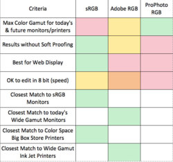
So let me start with a chart that I put together some time back showing my opinion of the trade-offs of the three main color spaces. This may answer some of your questions. Green being best, yellow next best, orange a bit worse and red the worst. Note that none of these three color spaces is overall "best". There are just trade-offs in what you use.


i-5K8H6q6.jpg

With proper color management software, images can best be moved from the three editing spaces to viewing in your monitor space.

Monitors come in two flavors these days
a) close to RGB gamut yet not exactly so ideally you have the calibrated and profiled with the appropriate software and device (e.g from Xrite or Datacolor) and use color managed software and OS settings
b) close to Adobe RGB (wide gamut monitors) yet not exactly Adobe RGB so the same caveats in "a" apply here as well

Printers have various range of color gamuts depending on printer, ink, and the paper used. So the gamut can range to be less than sRGB to similar to Adobe RGB in gamut size yet shifted off a ways.

So each printer, ink, paper combination needs its own ICC profile for proper color management. Good prints and paper companies supply these. Many big box print stores will just use sRGB as the assumed color space and print the best they can for that color space.

Now a key factor here is that even if you have your whole workflow totally color managed, you customer may or may not. With the majority of consumer monitors out there still close to sRGB (note wide gamut) and many don't used color managed software, the industry standard for output to Web is sRGB. It will work well for the majority of folks. It will look highly saturated if they have a wide gamut monitor and are not using color managed viewers.

Also, using larger gamuts than sRGB only helps for those images that have a larger gamut than sRGB. That is typically the minority of images yet you have come across them yourself.

So if you are going to use Adobe RGB or ProPhoto RGB, it would be good to have a wide gamut monitor, know Soft Proofing inside and out and then use it for previews, know the options for converting to sRGB and the various available rendering intents and other settings such as Black Point.

So yes, sRGB as the end goal for monitor viewing and printing may can be sufficient and an easier path to take and avoid knowing as much about all the color management issues. Yet it also true that you can get a more colorful print for images that have a wide gamut that you cannot get with sRGB. So its a pick your poison type of situation.

I am sure you will have more questions yet thought this might help you move forward at least to more questions.
Hope it helps
John Wheeler
 
Thanks John, yes all of this does help.

Really... I am still greatly confused by this one off experience. Has all my exports from LR (sRGB obviously) been different to the version I created with the RAW 14bit DNG file that I was working with at the time? Am I just dense and only now have noticed a difference? Is it because this particular image is really bias towards exploiting the pros of PhotoPro vs highlighting the weakness of sRGB and that this is why only now I am (noticing) bringing this up... (I thought perhaps it was a bug with recent LR release or something at first...)

99% of every image I take is to end up as a Jpg, either for sites like Flickr, Facebook business page, Instagram or as Jpgs for clients. The other 1% might be that I don't necessarily care about the Export as a Jpg but use the Print Module in LR to make a print (a real life Jpg lol, or in this case a real life DNG?)...

I always shoot RAW, or at least 99% of the time shoot RAW. Switching to shooting to Jpg with my camera does have its benefits, faster fps, better buffer limits etc, but I am aware of the dangers in doing so (White Balance better be correct at the time, less data to work with for highlight/shadow recovery etc).

But now I am starting to rethink my entire editing process. Should I be loading the RAW 14bit files into LR and then making important exposure adjustments to take advantage of that initial (superior over 8bit Jpg) RAW data. But then once that stage is complete should I be toggling out of 16bit/ProPhoto and into 8bit/sRGB sooner rather than later and continue, moving onto the edit process that deals more with the 'colours' and 'artistic' aspects, just for the sole purpose of WYSIWYG for when it finally ends up as a Jpg? (I don't like surprises!)

What is going through my head now is why am I wasting time editing in one space when I will eventually lose that 'look' when showing the work to clients or internet sites. With the above OP example, I could for example push the reds and magenta more and get an Export that more likely results in looking like what I currently intended. It will (of course) look more ghastly in LR/PS (overdone in it's ProPhoto 16bit workspace), but the Exported sRGB will actually be 'cooler' and resemble more my original intent.
But I can't work like that... I can't edit in one place thinking its going to be the same when actually not, and then second guess things. From your chart above it seems the benefit of using ProPhoto is that it looks nice for users, in our programs and our nice fancy monitors, but how is that relevant really in the grand scheme of things? Photos end up being Jpgs! Better to have loved and lost than never to have loved before? hah! Maybe not?

FWIW I can relate to the the photographers work being judged indifferently to clients. Just the fact my monitor is calibrated but the client is looking at my work on a non calibrated screen (smartphone even) can throw up arguments and points that are not valid as we are each talking from different canvas's...

It's almost like I need to ask a client what they will be looking at my images on, and then calibrate my monitor to being the same as theirs so that when I edit it will look the way I what/intend on their device/screen. I almost need to edit twice, once for me (that will look good for my screen and I know it will print well) and once for client (their screen etc)..
 
Hi BruceBanner
I think you have captured a pretty good understanding of the tradeoffs. Some folks just keep an sRGB workflow.
So here are my thoughts in separating out the choices.

1) 8 bit vs 16bit (or whatever your camera supports i.e typically 12 or 14 bits)
Doing at least you initial editing in 16 bit has real advantages to pull out details from shadows or highlights. You can actually keep it in 16 bit up until you do the final exporting.

2) sRGB vs wider gamut color spaces. You might be just fine with what you said about yours and your client's needs. So it may be just a matter when you convert to raw. LR does not change the color space until you export so you would want to turn on soft proofing with it set to sRGB to be able to edit and see the end result. If jumping to PS, you could also turn on soft proofing and edit there. This gives you slightly more control over the look of the image rather than converting earlier.

3) If you stay in higher gamut color spaces with sRGB proofing turned on, you can always save a version with the wider gamut and a separate version when exporting.

4) Note that JPEG only comes in to play when you want to export and not before. It only supports 8 bit yet it does support all color gamuts. Not that other options can include PNG or TIFF yet due to the reduction in storage space with the lossy compression of JPEG, that is the most common. Given that the lossy compression introduces artifacts, I suggest this is not the version you use as your long term archive. I would size the image for what is needed for viewing/printing and at the highest quality compression for image quality that does not cause problems for web viewing etc. As you have seen from my chart and what you have stated, exported in sRGB with the profile embedded is about the best you can do given the uncontrolled environment of your customers.

5) There are some trade-offs yet you could convert to sRGB (you can still stay in 16 bit) earlier and then you would not have to mess with soft proofing. This is an approach that can be considered for your workflow. It gives you less control with subjects that might have high saturation such as flowers in brighter sunlight yet may not be a problem for the majority of images.

So I don't thing there is a right or wrong or best and worst, just some tradeoffs to consider and take the one that best works for your needs. Wouldn't it be nice if there was one "best" answer and not even have to make the decision. Life is rarely that easy :)

Hope this helps and best wishes on whatever path you choose.
John Wheeler
 
Have a look at this (if you have time) see what you think. Right now I am curious why the Export As preview seems to be so 'off' (in the grand scheme of all things);

 
Hi BruceBanner
I hope other Forum members will jump in with their understanding as well. Here are a few thoughts

1) Many have had trouble with FastStone for color management so I will put up a yellow flag. I have avoided it for that reason. There are "supposedly" settings in FastStone to turn on color management and also I have seen posts that indicate you need a little adder program to have good color management with FastStone. You would have to ask someone other than myself as I just avoided it given the color management issues in the past.

2) I would not trust the Export As preview or the Save for Web preview as the resource for soft proofing. I have not seen detailed explanations of how those previews within PS work (or don't). I see both of those functions as "helper" programs to prepare for a particular environment with options on converting to sRGB (if not already done), possible output to different sizes, embedding profile or not and in the Save for Web for fine tune control of compression settings and many other parameters. I do not see those functions as an accurate preview for what your are going to get in the final output (though they should be reasonably close)

3) For a more accurate preview in PS I suggest two approaches
a) Use soft proofing in PS which means understanding the options available such as rendering intent, black point compensation, etc and then you have a more accurate representation of you image as full screen
b) Save your original file with all its Layers etc as PSD or Layered TIFF in the original color space and create a second version for outputing using the Edit > Convert to Profile command. Again, using this command you should know all the underlying options for rendering intent black point compensation, and of course targeting you final color space desired.

4) In Lightroom you have soft proofing and also, if you import to Lightroom with an image that already has a color profile embedded, it will preserve the profile for viewing purposes. Note, for the most accurate representation, view in the Develop module.

If you follow the above approaches, let us know if you have any remaining discrepancies
Hope this helps
John Wheeler

PS - Welcome to the wonderful crazy world of color management.
 
Hi Bruce Banner
Since you are using a particular image in the videos, it would be helpful if you could share that image on an image sharing service (e.g. DropBox) to try and duplicate what you are seeing and see if we have the same results on other forum members computers and it would be easier to also determine what is going on. I would suggest that as the next step. The videos are quite helpful btw in getting your issues across.
John Wheeler

Sure, I dumped it on my onedrive, should be able to grab it here; https://1drv.ms/u/s!AokJS98l4LvigeA9tEj59chUgPthTA?e=2FftZy
 
Hi Bruce Banner
Thanks for the additional video. You actually touch on a variety of topics in the video which would be worth exploring such as I think that there several separate topics i.e. color space, bit depth, and file format are talked about in ways that makes me think that they are strongly coupled to each other. The topic of 16 bit and 8 bit is to the first order independent of using TIFF vs JPEG (other than JPEG only supports 8 bit).

However, the key topic I think should be focused on is the difference in what your eyes are seeing on your screen between two side by side images that other than soft proofing adjustments would be identical. If we can get to root cause on your issue then it could be productive to move on to other topics (just using the divide and conquer approach)

Note that since I do not have your monitor (or even a wide gamut monitor) what I see by its nature could be different and I am trying to take that into account. Note that observations of color differences could be related to a number of factors in the color management pipeline from hardware, software, and including your eyes (optical illusion).

I want to first rule out a couple factors such as potential issues with your monitor and also optical illusion. The reason I want to focus on that is you are seeing color differences in areas that are not even targeted as being out of gamut in your original. To the first order, that should not happen especially if you are using "relative" intent. Yet you are seeing differences. On my screen (albeit not a wide gamut monitor), I did not see any differences between the two images per se. I even took your video image, overlayed the left and right images and used the difference blend and it also showed that there was no significant difference. That is not conclusive because you went through video software and that was viewed on my computer.

Sooooo, here is what I want you to try out and will only focus on Lightroom

1) In the soft proof panel download the ProPhoto RGB profile and select that profile for soft proofing. Also use relative intent when soft proofing to ProPhoto RGB. When soft proofing to the same profile as the color space of the original image should not produce any shift in color.

Follow the same steps you did before in viewing the original and proof side by side for differences. If you see perceived differences (and there should be none), they we are dealing with a much narrowed space of issues. Those could include a software bug, hardware display issue, or optical illusion (many sources). Please report on what you see and look for any differences between any part of the two images using different magnifications.

2) This next test is to try and help rule of software proofing issues.
- Create a separate test image to make these changes in Lightroom (easiest is to create a virtual copy)
- Make sure soft proofing is turned off
- Hold down the shift key in the Develop Module and in the lower right corner click the button that says "Reset (Adobe)". This will reset all Lightroom settings for this image
- Click on the icon that brings up the side by side Before and After screen. These should be identical because you are viewing an image with zero adjustments
- Do you see any differences in the left image and the right image? If you do, we can rule out soft proofing issues and this would further narrow down the problem

3) Third test
- Using this Virtual copy, create yet another virtual copy
- Go to the Library module and set the display (and zoom if needed) to view the first virtual copy with the second virtual copy side by side.
- Do you see any differences between the two images? There should be none
- This test eliminates any software issues in using the before/after viewing in the Develp module. Note that in the Library module all images are viewed in Adobe RGB yet both images should be treated the same. There should be no differences

Please report on the above experiments. This will help narrow down where to focus the differences that you see. If you need more details or images of what I am requesting in 1,2, or 3 just let me know.
John Wheeler
 
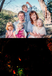
While you are working on those tests. I did some of my own on a different front. I did this test/processing in Photoshop
- I took your image as ProPhoto RGB 16 bit and duplicated that Layer
- On that second Layer, I coverted that image bits for just this second Layer to sRGB relative intent and then back to ProPhoto RGB via a Smart Object approach
- I took the difference between the original and the the second layer that went through color space conversion via the difference blend
(Note when changing the image from sRGB back to ProPhoto, if it is in Gamut (which it would be since sRGB is totally within ProPhotoRGB - it does leaves the colors the same)
- I extremely amplied the resulting difference result to show any differences from the original, and place the original above the result for reference

Note that the woman's face has just a couple bits that were touched and there so going through the color space change did not change the color numbers. So changing color spaces is not the reason you are seeing / perceiving color differences.

I used the approach above to numerical see the differences and not depend on my own screen being a narrower gamut monitor.

The few changes that are seen are in the exact locations that the color clipping window noted that would be out of gamut colors that would be adjusted.

So the search for you root cause continues. I have my suspicions of the source of the problem yet will let the data and the results of your test help guide the search.
John Wheeler

IMGP3446-Edit-sRGB-softproof-compare.jpg
 
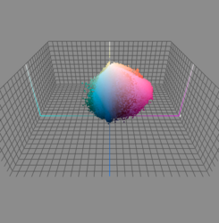
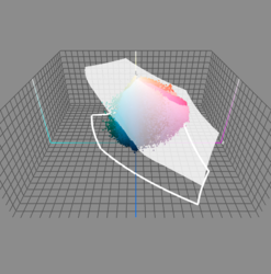
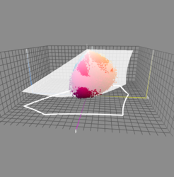
To help you get an idea of what is in gamut and not in gamut on your image, I have used a program named ColorThink Pro to display a 3D map of the colors in Lab Color Space

This first image is every data point of your image plotted out in that 3D space. Note that the color space is just not colors yet a space that encompasses all tones as well:

Screen Shot 2019-10-17 at 1.25.01 PM.png


This second image is the same as before yet I have overlayed in white color the boundaries of ProPhoto RGB color space. Note that all of your colors fit within this much larger color space:

Screen Shot 2019-10-17 at 1.25.19 PM.png


However, when I remove the ProPhoto RGB color space and boundaries and replace in with the SRG color space boundaries, you can see that some of you colors are outside that gamut. This includes some of the cyans going to blue as well as some of the magentas and organish yellows (flesh tones). Note the flesh tones are not out of gamut by very much

Screen Shot 2019-10-17 at 1.25.33 PM.png


In this last image, I rotated the view so you could see the boundaries from the magenta side. This shows that both the light magnentas and darker magentas were out of gamut. All of these match the gamut warning limits you were seeing in your image.

Screen Shot 2019-10-17 at 1.25.53 PM.png

The relative intent of rendering in change color spaces will map those out of gamut colors just to their respective edge of the color space boundary. This leaves all the colors already in gamut alone. If a lot of colors had to be moved this way, you could lose so color detail having the suble variations all crammed on the surface of the boundary.

What the preceptual intent tries to do is salvage that detail so moves more of the surrounding colors and colors that are already "in gamut" proportionally into the color space volume. So bits experience color shift yet it can be perceived with better tonality and less loss of detail in the most saturated areas.

So the choice is just a tradeoff.

However, the color shift you are seeing I believe is unrelated to color space mapping. Looking forward to your test results from my instructions two posts ago.
 
Sorry, life got in the way of all this and I have not had a chance to revisit any of this, but I do plan to do so. I just wanted to say a huge thanks to all the replies and that the advice given has not been for nothing or been ignored. Realistically however I might not have the chance to look at this till later next month. Please be patient! Thanks!
 

Back
Top