barnesy1977
New Member
- Messages
- 2
- Likes
- 1
Hello all,
My first post here....I'm hoping to get some advice on a basic PS query.
I'm self taught on PS (just basic stuff really) but I manage to do everything I need to for most of the time. I've previously had PS work carried by third parties - who know what they're doing more than I do, but are also quicker than me. However I need to make an adjustment on a file, but I can't work out the best way.
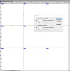
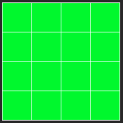
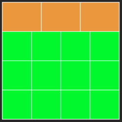
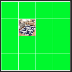
I've attached a JPG of the image and the PSD but with the rugs deleted off it to reduce the file size. You'll see that the image has a white grid separating the 15 boxes. This grid is all 'one-item' and on its own layer. However I need to edit the grid so that the top row also has 4 boxes on it, and thus becomes a 4x4 grid. I know I could just delete the grid and draw a new one, but I'm keen to learn the easy/best way of simply editing it. It's probably a very basic PS thing, but it's something I've never come across before or needed to do. I'm quite experienced in AutoCad, and in that software, we'd 'explode' the grid and trim/extend the individual lines etc and/or draw the new sections on.
Can anyone suggest how I should be doing this, or the correct photoshop terminology ?
Many thanks in advance


