What's new
Photoshop Gurus Forum

Welcome to Photoshop Gurus forum. Register a free account today to become a member! It's completely free. Once signed in, you'll enjoy an ad-free experience and be able to participate on this site by adding your own topics and posts, as well as connect with other members through your own private inbox!

Draw an outline around a shape at a uniform distance...


polarwoc

Guru
Messages
1,585
Likes
1,431
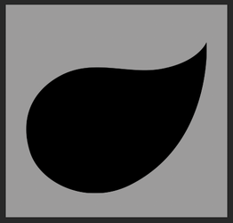
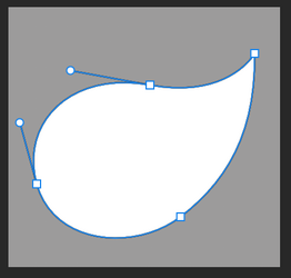
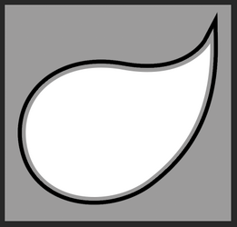
Hi all, I have this slanting droplet shape,
Screenshot 2024-10-10 121152.png
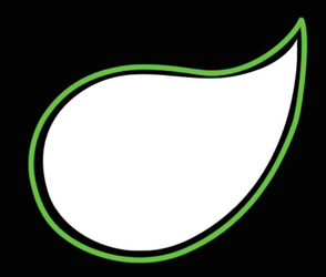
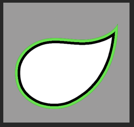
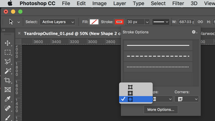
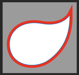
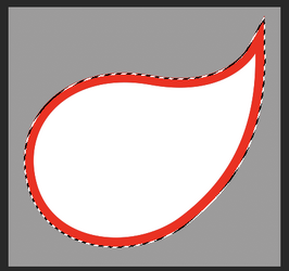
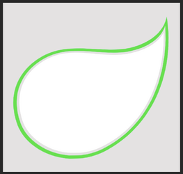
and I am trying to give it an outline in such a way that the distance between the shape's exterior and the outline is uniform throughout. Here is what I obtained...
Screenshot 2024-10-10 121223.png

But, as you can see, the uniformity of the width between shape's exterior and the outline is bad.

Could anyone suggest a good method to achieve the same?
 
Here's one way..........

Isolate the teardrop.
Duplicate it 2 times for a total of 3.

On the 2nd or middle duplicate, convert to a smart object. Double click to open the PSB, go to >Image > Image size and increase the size of the image.......trial and error to know how big! This first step will determine the distance between the teardrop and the outlines inner edge.

On the 3rd or top duplicate, convert to a smart object. Double click to open the PSB, go to >Image > Image size and increase the size of the image.......trial and error to know how big! This second step will determine the distance between the outlines inner edge and the outlines outer edge.

Now you have to position and rotate the 2 new SO layers. I found it easiest to add an "inside" stroke to the 1rst (main) teardrop layer and then reduce the opacity of the each of the layers above so I could judge it's relative position to the main teardrop layer.

This was the 2nd or middle duplicate that I was rotating........I entered the rotation instead of trying yo drag it out. Note the move of the pivot point to the lower left corner.
Also, the pointy tails will not line up, don't worry about that as you can fix that later, just try to get a uniform distance around the main teardrop.
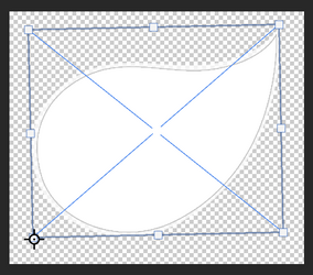
Screen Shot 2024-10-10 at 3.13.40 AM.png

Once I had the two duplicate layers aligned and spaced, I also added the stroke so that I could see the edges better.
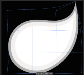
I then entered Free Transform > Warp > adjusted the pointy tail and made fine adjustments to the edges of the outline.
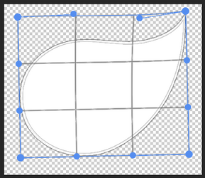
Screen Shot 2024-10-10 at 3.20.55 AM.png

Once all is aligned, turn off the two enlarged duplicate layers and make a selection of them.
On a new layer fill with white.
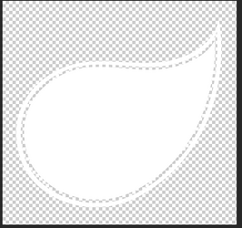
Screen Shot 2024-10-10 at 3.24.40 AM.png

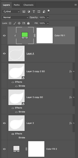
Add and clip a solid color fill adjustment layer and select your color of choice.
Screen Shot 2024-10-10 at 3.25.51 AM.png

Screen Shot 2024-10-10 at 3.44.09 AM.png

Even though this is not that difficult, HOPEFULLY, SOMEONE ELSE WILL HAVE A MUCH EASIER TECHNIQUE!!!! LOL! It's late and my head is not coming up with other techniques! I'll sleep on it!
 
You got a pretty decent outline with uniform spacing there, Sam. I will give it a go and come back with my result.
 
I followed your method, and found that a lot of experience and dexterity along with an eye for detail is needed while doing the Warping step. For example, this is my screenshot doing the Warping step:
Screenshot 2024-10-10 150103.png
I thought it was okay, but after seeing the final result which was this:
Screenshot 2024-10-10 150304.png
I realised the spacing is not really even and that I should have been more careful during the Warping stage.

I am wondering if there is any mathematical/scientific way of obtaining the result? I tried making a selection and enlarging the selection, but the pointy end would not align. Drawing it with Pen tool also did not ensure a proper result. Hoping there is a Stroke that can be set to go out by a set distance.
 
Hoping there is a Stroke that can be set to go out by a set distance.
Do you require that the original shape remains the same, or can it be reduced?

@GeneGraphics -- This is a great solution as long as there's not a problem with reducing the size and shape of the original

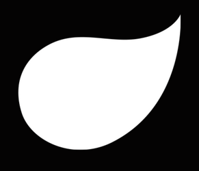
Original turned black for demo.
Screen Shot 2024-10-10 at 11.12.31 AM.png

Stroked layer on top of the black original layer.
Screen Shot 2024-10-10 at 11.12.47 AM.png

This is the stroked version with the strokes opacity reduced. You can see how it starts with the original size and shape and reduces it (the white part).
As long as this is not a problem, then this is a fantastic solution!!! But if, for whatever reason, you can't reduce the size of the original teardrop, then this may not work.
Screen Shot 2024-10-10 at 11.19.19 AM.png
 
Here's another solution that won't shrink the original. However, it does require that you re-create the teardrop with the Pen Tool to make it a shape layer.

Use the Pen Tool to make the teardrop.
Screen Shot 2024-10-10 at 12.56.19 PM.png

Duplicate the new teardrop layer.
Use the Direct Selection Tool add an outside stroke.
Screen Shot 2024-10-10 at 1.05.49 PM.png
Should look like this!
Screen Shot 2024-10-10 at 12.57.02 PM.png

Make a selection of the outside of the stroked area.
Reverse.
Screen Shot 2024-10-10 at 12.57.51 PM.png

Create a new layer and fill.........color won't matter.
Turn off the duplicate shape layer.
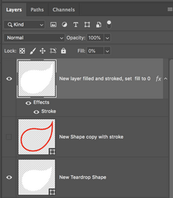
On the new filled layer, add stroke layer style, inside. Set the layers fill to 0%.
Screen Shot 2024-10-10 at 1.01.44 PM.png
Screen Shot 2024-10-10 at 1.20.32 PM.png

Again, not perfect. But it's a step closer if you have to preserve the size of the original shape.
 
Can't it be achieved by just using stroke layer style?
Thanks so much, my friend. That gets me a solution that I can live with.

Do you require that the original shape remains the same, or can it be reduced?
If I can retain the shape, that would be even more desirable. I understand that the solution by GeneGraphics reduces the size of the MilkDrop.

Again, not perfect. But it's a step closer if you have to preserve the size of the original shape.
This solution does go a few steps ahead in achieving my target.

Thank you all very much, guys.
 
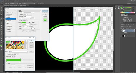
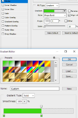
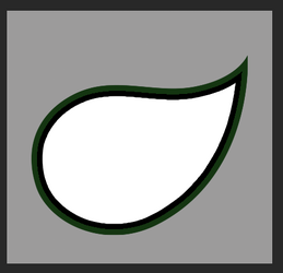
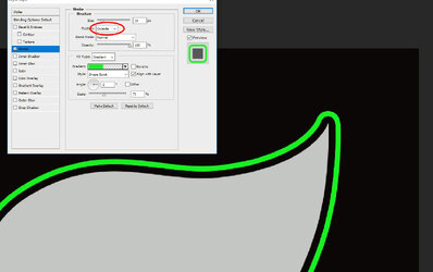
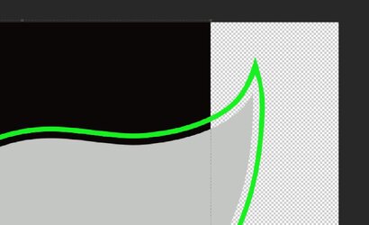
To preserve the actual size of the image, again we can use Stroke Layer Style. Same settings on my previous post but this time make it OUTSIDE.
It will just create a rounded tip so we need to use a Pen Tool to create a pointed one.

Capture.JPG

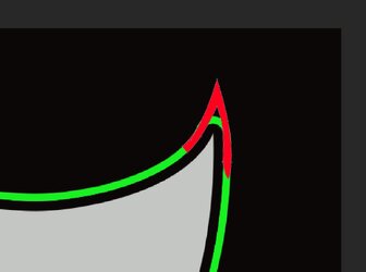
Create the pointed tip in a different color first. Once finished, you can change it color to green.
After that we need to erase the rounded one. So first select again the image (Droplet) layer then convert it to Smart Object. Add a layer mask (in White).
This time you can now erase it manually using Pen Tool (Black).

Capture b.JPG

Capture c.JPG
 

Back
Top