Photoshop Gurus Forum
Welcome to Photoshop Gurus forum. Register a free account today to become a member! It's completely free. Once signed in, you'll enjoy an ad-free experience and be able to participate on this site by adding your own topics and posts, as well as connect with other members through your own private inbox!
You are using an out of date browser. It may not display this or other websites correctly.
You should upgrade or use an alternative browser.
You should upgrade or use an alternative browser.
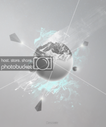
Desolate Poster
- Thread starter Inkz
- Start date
tomross
Well-Known Member
- Messages
- 85
- Likes
- 49
Hey Inkz.
I really love the composition here. The angels and the focal point are working really well.
I wonder if it's playing it a little safe though in terms of colors? I don't know if you're going for the less-saturated feel for this piece, but I couldn't help jumping into PS and having a little play around.
I'd love to see you bring what is a very strong composition 'to life' with some intensity.
(this may be a little overdone, but was a quick play around in PS):

ForeverFallenAngel
Power User
- Messages
- 200
- Likes
- 118
I like you're version Inkz just my personal opinion it looks icy,cold and the turquoise and grey type colors are really complimenting 
tomross
Well-Known Member
- Messages
- 85
- Likes
- 49
ForeverFallenAngel: Yeah I do really like Inkz's version, it has a great palette. I guess it all depends on the desired look. As with most images there are a variety of possible outcomes. I just wondered how it would look of the planet structures appeared to be floating in space themselves.
- Messages
- 23,632
- Likes
- 13,543
Inkz, I personally like your rendition which steps away from the conventional depiction of traditional space scenes, much like what has been suggested by our newest self proclaimed expert. I believe that you did this intentionally which demonstrates why your such a visionary and not stuck in the rut of average.
ForeverFallenAngel
Power User
- Messages
- 200
- Likes
- 118
ForeverFallenAngel: Yeah I do really like Inkz's version, it has a great palette. I guess it all depends on the desired look. As with most images there are a variety of possible outcomes. I just wondered how it would look of the planet structures appeared to be floating in space themselves.
The reason I like his version is due to the ice,mountains have ice n snow caps not fire. So maybe change to volcanoes instead of snow caps then I probably would of gone with the red. I love the colour tho and nice to see a different perspective.
Last edited:
Trevor Dennis
Well-Known Member
- Messages
- 153
- Likes
- 99
Excellent perspective Inkz. By what I think is no more than the sizing of the pyramids, you have created a fully three dimensional composition. Maybe the TomRoss coloured version has a tiny bit more impact? I am also visualizing the beams crossing in the same place with a star burst.
Tom Mann
Guru
- Messages
- 7,222
- Likes
- 4,343
"Inkzs' would imply more than one Inkz."
But I want to know about "Inkz's", not "Inkzs' ". :evil:
Then, of course, there is also, "Inkz' ", which, now that I think about it, might be the best choice.
Ahh, such weighty questions.

T

