What's new
Photoshop Gurus Forum

Welcome to Photoshop Gurus forum. Register a free account today to become a member! It's completely free. Once signed in, you'll enjoy an ad-free experience and be able to participate on this site by adding your own topics and posts, as well as connect with other members through your own private inbox!

Specific Darker consistent lighting for a horror piece


praygon

Member
Messages
10
Likes
2
Hello!
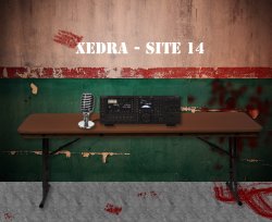
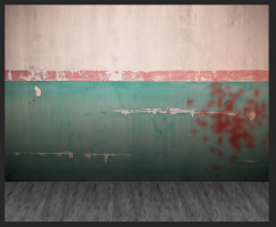
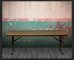
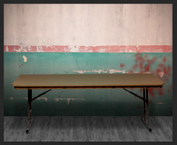
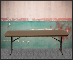
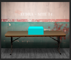
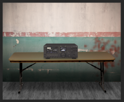
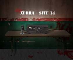
Im working on a piece I'm hoping to eventually animate for a horror video project but I'm a completely helpless newbie and I can quite figure out how to get the image to have consistent darker lighting. I've used assets from multiple sources and just something about the composition doesn't look right to me. The plan is to eventually animate this so a single beam of light from a light source off-screen and above will illuminate the ham radio and parts of the table.

Which will be it's own battle but firstly i just need to find a way to blend all the pieces together and i'd really appreciate any help to make this look a bit more natural and believable.

Mockup.png
 

Attachments

Last edited:
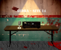
Not sure if this is what you had in mind. I added Level controls to each component so you can adjust them independent. Also add some drop shadow but the direction will need to match your desired lighting source position/direction. Hope this helps.

mockup (1).jpg
 

Attachments

I see two main issues with this: shadows and perspective.

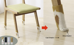
Regarding shadows, if you observe any real object in a real room, you'll see dark shadows where the object rests on a surface (see image). For example, your table looks like it's floating in the air because it lacks a drop shadow that the legs would cast onto the floor. Photoshop has a drop shadow feature, but you may be better off drawing your own shadows (use dark gray with a blend mode of multiply). In addition, in almost any lighting situation there would be, for example, a shadow under the table where the walls and floor are darker than on the outside of the table. Everything in your image is so uniformly lit—even before you add your single beam of light—that it looks fake and unconvincing as a real room with depth.

1642011649610.png


Regarding perspective, you have a few mismatches. We are clearly looking down at the tabletop; our line of sight is pretty much level with with the words "Xedra Site 14". However, we cannot see the top of the radio (or whatever that electronic item is). This makes no sense in the context of the table. For the radio to appear that way, we'd need to crouch down on our knees to view it straight-on. No amount of lighting and shadows will ever make that particular radio look convincingly like it's resting on the table. Also, the microphone seems way too big compared to the radio. But at least the microphone does look like it's actually sitting on the table. They both have fairly similar perspective.
 
Re-reading my post, I hope I didn't come across as unduly harsh. It was not intended.
I don't think you did.


There are multiple perspective and shading/shadowing issues that would help.

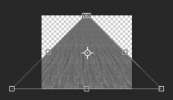
The carpet needs to be adjusted for perspective.
Screen Shot 2022-01-12 at 1.09.13 PM.png

Shadows on the carpet
Screen Shot 2022-01-12 at 1.15.32 PM.png

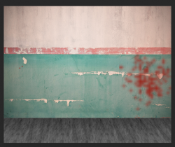
Shadows on the wall.
Screen Shot 2022-01-12 at 1.27.39 PM.png

Shadows and shading on the table feet and tabletop.
Screen Shot 2022-01-12 at 1.30.18 PM.png

Table shadow.
Screen Shot 2022-01-12 at 1.41.28 PM.png
Original
Screen Shot 2022-01-12 at 1.32.05 PM.png
 
As Rich points out, the radio is not in the proper perspective relative to the table.
This is more what the radio's perspective should look like....

Screen Shot 2022-01-12 at 1.49.49 PM.png
 
I tried to fake it with the radio by giving it a top and putting shadows under it. Here's what it could look like on the adjusted table that IamSam just posted.


1642017919562.png
 
OK I'm in total agreement with above statements. And I would have adjusted the various components to be more in sync perspective wise. However I suppose the OP is going for a more orthographic projection like look...SO...

I'm going in a different and hopefully helpful direction where I took what exists and tried to fiddle with that. I thought that might be illustrative of how someone else might approach dealing with what is here.

When I was done is was a nightmarish hodgepodge that no one looking for help could fathom even though I tried to use relatively simple processes. I more intelligently labeled the layers and grouped the various 'pieces ' into smart objects. These can be double clicked on to open them and see the contents. I hope the OP is familiar with clipping masks that allow specific layer to be acted on rather that every layer below it (that's the procedural layers with that little bent down arrow)
At ant rate ... .a somewhat different take , admittedly with a strange light source:)

I reread the original post . I have no idea why I thought it should be this ominously dark

mockup_4.jpg
 

Attachments

Last edited:

Back
Top