What's new
Photoshop Gurus Forum

Welcome to Photoshop Gurus forum. Register a free account today to become a member! It's completely free. Once signed in, you'll enjoy an ad-free experience and be able to participate on this site by adding your own topics and posts, as well as connect with other members through your own private inbox!

Dark prints


zelig

New Member
Messages
4
Likes
0
Hello!
I am working on architectural images created by Blender-3D, and am very new to Photoshop or any image editing.
I hear that for printing a suitable Color Profile would be Adobe RGB (1198). Then I read that printers require CMYK. Now I read that sRGB provides the closest match between screen and printer...! I am struggling with terrible darkening of my prints compared to the screen. The differences are so dramatic, I think it must be a color profile issue... I am confused.
The people at the printing place usually just feed paper to the printer (Epson Stylus Pro 9600), and really don't know much about settings. They claim to receive good files from other clients, and don't usually change any settings...
Any help would be very much appreciated...
Thank You.
 
Hi zelig
Do you use a color calibration device from Xrite or Datacolor.
It is not an absolute must yet there are few steps to get good match between your monitor and the print.
1) Calibration - that is the set up of your monitor to a know fixed settings of brightness, contrast, etc that you will not chnage
2) Second step is to profile the monitor with one of the color calibration tools from either company I mentioned

With the above, you monitor will be calibrated and profiled.

With a printer, if you have a generic printer, they are most oftne default califbrated to sRGB yet the better printers or paper companies will provide a color profile for the specific printer/ink/paper combination. If you do this in addition to the monitor steps above you should have a good match

Now the shortcut: The most common problem iwth prints coming out dark is that you have the brightness set too high on your monitor.

Here is why that happens.
First, the printer is dumb and just prints the color numbers you send to it
If you have a bright monitor, the image will naturally look too bright so you turn down the exposure (make the color numbers smaller) so it looks good on the monitor. Yet the monitor was set artifically too high in brightness so you artificially turn down the exposure too much and prints come out dark.

A common guideline is to have the monitor set at 80 to 100 CD/m2 brightness to get a reasonably good match yet many like to have their monitors set much brighter then that.

I don't know your monitor or OS so hard to give you a rule of thumb. For my MacBook Pro, the brightness is set in the System Preferences under Displays and the slider ends up being set right about the midway point to get a better match to the printer. Best way is to use one of the measuring devices for calibration and profiling as per above to get the best result.

That is my best shot at your issue without any more details from you. Turn down the brightness way down on your monitor and then make adjustments where it looks good on your monitor and try another print. I bet it comes out lighter.

Hope this helps
John Wheeler
 
Thank you very much John.

I will now try figuring out monitor brightness as you suggest.
I don't think I will get a calibration device as my clients like bright happy colors, and every detail of their buildings to show clearly. Not very creative when it comes to 2D creations... So I really don't have to be precise about my work, I only need to overcome this big difference between screen and print.
On the other hand, I have an old, definitely not for artists monitor...

Thanks again for the detailed reply. I will post if there is progress.

WIndows 10
Monitor- lg flatron w2343t
 
Last edited:
Hi zelig - I totally understand. For viewing on a screen, most like the higher brightness in most cases. Most often, if you create the image with the lower brightness it will be correct for the print and then you can turn up the monitor brightness for viewing with clients. If the target audience is another monitor somewhere, doing your adjustments at a higher number such as 120 or somewhat higher would be appropriate. Unfortunately, you don't have control over the brightness level at the customers end, only the monitor in front of you.
It would be great to hear if and how you resolve your issue because it will help others with similar issues.
John Wheeler
 
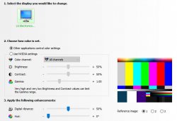
How would I set to 80 to 100 CD/m2 brightness with my monitor's settings options, as seen in the attached image?

Capture.JPG
 
There may be another forum member that can help yet I personally have not had any good success trying to eyeball adjustments to something that gave good results. Too many things play into the sensation of brightness including room lighting, if monitor is set to automatically adjust room to room brightness and your own eyes where the pupil opens and closes to adjust for lightness.
I finally bought a measurement device to take me out of the near endless loop of adjust on screen, print, go back and make changes, print, etc etc until the print came out somewhere where I wanted it. I do enjoy not have to go through that loop now. My reference on the Mac of where it was set was based on setting up my monitor with the measuring device and then noting where the brightness slider was set for the desired monitor luminance set through the calibration process. Sorry I could not help you with a work around and maybe another forum member has some thoughts on this. Note that a brand new measurement device is in the range of $150 to $170 with no discounts or looking for deals. Not affordable for everyone yet one has to compare to the cost of prints that one throws away as well.
Just my opinions of course.
John Wheeler
 
Thanks John.
I now see the measurement devices that go for $170. Before only the $400 ones popped up on Amazon.
Are these devices any useful for lousy monitors like my own- lg flatron w2343t ...?
 
Hi zelig
Your question about usefulness or value is a judgement call. If you dark prints issue went away you might still call that useful and all depends on your budget as even $170 is not a drop in the bucket level of cost. So I will have to let you be the judge of final value.

I can comment on your monitor based on its specifications on how that compares to more standard monitors for Photoshop work
- Range of brightness is fine
- Color gamut is about he same as sRGB color space and that is the standard for the internet. (Their spec is 72% NTSC which is about the same as 98% sRGB
- The panel type is TN which is not as good as an IPS display. A TN display does not have a wide viewing angle. How this comes into play is if you tilt the monitor up or down or left and right, the brightens and color will shift. If you were trying to get good color matches, it would be important to be looking at the monitor dead straight on which can be a pain to remember to do. Even when viewing the monitor straight on, the colors in the corners of the monitor might be slightly shifted. It is a lot easier to have an IPS display.
- From what I have gathered (80% sure), this monitor is actually a 6 bit depth monitor and only achieves effective 8 bit depth by the use of dithering. This would not impact setting brightness levels yet you would want to double check that the color calibration/profiling equipment you purchase supports your TN monitor.

So not impossible to doing photo-editing with your monitor yet it is much easier to get color accuracy with an IPS monitor.
Hope this helps
John Wheeler
 
Hi Zelig -
@thebestcpu has given some solid advice and I'm certainly not on the same technical ground as he is. His best advice, if you're coming up with dark prints, is to calibrate the monitor. That way the print will match closer to what you see on the screen. Also his advice on brightness - I had to adjust this on my monitor as well to get more representative prints.
One item to clarify since there may be some confusion I see in your initial post - any image displayed on a screen is RGB standing for Red, Green, Blue. That doesn't change. Anything and everything you see displayed on a screen is displayed as RGB - Red, Green, Blue.

But printers rely on ink which prints, at minimum, in CMYK or Cyan, Magenta, Yellow, and Black. That is the basic difference between screen and print. Never changes - that's just the nature of these two very different technologies.

The calibration that you do will give you a closer match to the screen image and the printed image. But they are two very different technologies and will present differently.
That being said - if you're going to print an image, my best recommendation is to work in an Adobe RGB 1998 workspace and not sRGB. The Adobe workspace will provide you brighter and more vivid colors when you print. But as John mentioned, the vendor should be setting the profile of his particular printer to both the printer he's using as well as the stock he's feeding it.

It can be a bit overwhelming to get into this discussion. But if you just research "Adobe RGB vs sRGB" you'll get some additional info on the two versions. Here's an article that, although it deals with photography workspace, can give you some insight (and look thru the comment section):


I've made my own mistakes here when I've downloaded an sRGB file to retouch, convered it to a working space, and then posted, the colors were different from the original image even though the only change I made was to the working space.

I hope I didn't muddy up this debate. But the single most important thing to pay attention to is calibration. Everything starts there.

- Jeff
 

Back
Top