What's new
Photoshop Gurus Forum

Welcome to Photoshop Gurus forum. Register a free account today to become a member! It's completely free. Once signed in, you'll enjoy an ad-free experience and be able to participate on this site by adding your own topics and posts, as well as connect with other members through your own private inbox!

Critique please!


punkysue

New Member
Messages
1
Likes
0
mag01.jpg

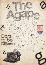
hey all! Im new to this photoshop gurus forum, hoping for some comment and critique on how to improve my magazine cover submission for my high school.
I think the "dare to different" part looks abit odd but i cant quite figure out how to make it nicer.
Thanks =)

oh btw, i got the idea from a tutorial at psdtuts.com =)
 
Couple of suggestions: make the font size grow gradually from the typewriter to the title. This will give it perspective and add some depth to the z-plane. I would also move "Dare to be Different" copy to where the "g" is in the right hand corner. Being above the typewriter make the piece a bit heavy on the left side. The word that needs the most gravity is "Different". I suggest "Dare to be" on the top line in a smaller size, then "Different" on the second line.
 
My suggestion would be to get rid of the very large out of focus letters. It just seems to add unneccessary chaos to the picture and is very distracting which pulls away from the main focus of your image.
 
I agree with tricky500, get rid of the large letters. I would switch the school logo (I assume) and the "Dare to be different" and maybe move the typewritter over a little more center. Great typography in the title though.
 
Are u from Indonesia ????

Nice job btw if u could arrange the small letters in a perspective way.....grade it from small to large
 
I like the idea of the letters from the type writer gradually growing, I think that would look nice as well as getting rid of the random larger letters mixed in.
 
The T, H, A, D, and especially the G are pretty distracting. Overall an awesome design, well put together. Only other thing would be make your main design (The Agape) fill up a lot of the top section, make it noticeable, make it dark. If that faded H and lowercase a were gone, then you'd have room. Keep it up.
 
05-16-2009 - 700+ views ago, I think he may have had some time to complete it xD
 
Last edited:
this request came in in 2009 time to go to sleep
 

Back
Top