What's new
Photoshop Gurus Forum

Welcome to Photoshop Gurus forum. Register a free account today to become a member! It's completely free. Once signed in, you'll enjoy an ad-free experience and be able to participate on this site by adding your own topics and posts, as well as connect with other members through your own private inbox!

Could someone advise me on how to improve my work?


bella_alien

Member
Messages
11
Likes
5
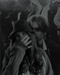
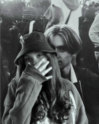
I’m really stuck on this one. Me and my cousin went to this concert thing recently, and we didn’t get to take any pictures together so he asked me if I could photoshop the two of us together.
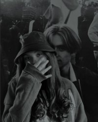
E05A38BD-3BC7-4349-80FE-AADA206FC34D.jpegHere’s what it looks like so far. How do I make the colour and the shadowing of our faces look a bit less fake and more natural? Could someone help me out?

60A3A2D5-B5CD-4132-9CB9-D60880436372.jpeg
there’s also this image, but I used a filter , I guess it looks more natural? If any you would like to do anything to improve any of the two pictures above I’d highly appreciate it! I’m still so new at this whole photoshop thing hehe
 
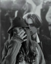
I think yours is pretty good. Just a few small things that I would change:
  • I think you are lit a little brighter than your cousin, so I used a Curves adjustment (you can also use Levels) to make you a little darker.
  • Next, you seem to be slightly more in focus than he is, so I applied a small gaussian blur to you.
  • Last, he has a lot of graininess on his face, but your skin is smooth. So I added some grain to you.
In my first step (darkening), I did it by eye. But if you want to be more precise, you can use the Color Sample tool, which allows you to click on a few spots in your image and it gives you a read-out of the exact RGB color in those spots. Try to find two areas that ought to be lit the same, like maybe the highlight on his forehead and the light parts of your fingers. Thenm, when you darken yourself, you can have a specific RGB target in mind.

E05A38BD-3BC7-4349-80FE-AADA206FC34D.jpg
 
One more thing... there's nothing wrong with the overall darkness of your image if that's how you like it. But once you're done matching you and your cousin as best you can, you can brighten up the entire image with a Levels adjustment to bring out the whites.

E05 v2.jpg
 
I would add that you're getting too much light, mostly on the right side, I can't be sure without looking at the original but one solution could be putting you behind him instead...That also usually helps with the blending sensation ^^
 
This was s tough one. The background image with your cousin seems flat compared to you. As @Argos mentioned, it's a matter of playing the lights and darks as well as the grain.
I took a slighly different approach by cutting you out and put on a separate layer. Then adding a Levels adjustment layer and darkened the output so you matched your cousin.
Then added some grain - maybe a bit too much - to the entire shot. Finally I cut both you and your cousin out, placed on a separate layer, and blurred everyone behind you so you had a better visual match with each other.
Also cleared up a few distractions including blemishes on the face.
I can post step by step if this works for you. I don't work int he usual way - I'm self taught so go a bit rogue at times. :cheesygrin:
- Jeff
concert couple edited 3.jpg
 

Back
Top