The problem you describe is well known. In the real world, intensities of light are, with few exceptions (eg, lasers), completely additive. So, if you have a red circular source of light at a given intensity shining on a piece of white paper, and a green source of light at the same intensity doing the same, what you will see is a yellow area with double the individual intensities. The same is true of non-primary colors, as well.
The problem you observed arises when one tries to represent light intensities by numbers that only run over a limited range of values, eg, 0-255.
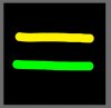
If you "add" (using the "color dodge" layer blend mode) pure bright red (255,0,0) to pure bright green (0, 255, 0), everything works out fine and you'll get a pure bright yellow (255, 255, 0).

However, if you try to add non-primary colors like (255, 100, 100) to (100, 255, 100), the limitations of the numerical representation prevent you from getting (355, 355, 200), which is what you would get in the real world. Instead, the best it can do is (255, 255, 100), and that's a very different color from what you expect.
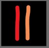
This applies to the example you posted. Your red and green brush strokes are nearly pure primaries. In other words, they are nearly zero in two of the channels. OTOH, your yellow stroke is close to (255,255,0), and your orangish stroke is around (255, 242, 57), so even if you use the correct layer blend mode (ie, "linear dodge (add)") instead of the "normal" mode (at 50% opacity) that you used, you still won't get the correct colors at all the intersections.
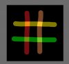
About the best one can do is reduce the overall intensity of each of your two layers to half of its original value so that none of the channels exceed 127. Then, when they are added together (ie, in linear dodge mode), all the colors (including the intersections) come out correctly because no channel can possibly exceed 255. The result is shown below. It's very similar to what you got using "normal" mode with the top layer at half-opacity.

Unfortunately, it's dim, and there's no way around this if you need the hues and saturation values to be correct.
Of course, for many applications, this is unacceptable, so people "cheat" and use a different layer blending mode (eg, "screen") with the full intensity starting brush strokes, and get something that is brighter, but the hues and saturation values at the intersections are off from what would happen in the real world. This result is shown immediately below.

HTH,
Tom