_alexbrandt_
Well-Known Member
- Messages
- 71
- Likes
- 10
Hello there,
I have a question related to the color overlay styles available.
I'm trying to make different previews of paint options for a wall at a local gym.
So I took a picture of one of the corridors.
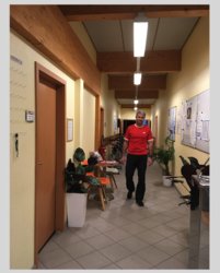
I'm trying different color options for the walls taking from these color codes.
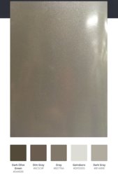
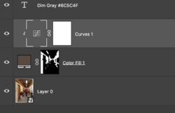
I created a mask the yellow areas of the wall.
Then I created a solid color layer and applied the mask to it.
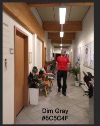
So far I've been using the "color" or "saturation" overlay style, however, I feel it is not always giving an accurate rendering of the selected color.
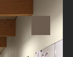
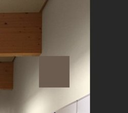
For instance, the "Dim Gray" version I made doesn't look at all like the selected color.
Any ideas ?
I have a question related to the color overlay styles available.
I'm trying to make different previews of paint options for a wall at a local gym.
So I took a picture of one of the corridors.

I'm trying different color options for the walls taking from these color codes.

I created a mask the yellow areas of the wall.
Then I created a solid color layer and applied the mask to it.
So far I've been using the "color" or "saturation" overlay style, however, I feel it is not always giving an accurate rendering of the selected color.
For instance, the "Dim Gray" version I made doesn't look at all like the selected color.

Any ideas ?

