What's new
Photoshop Gurus Forum

Welcome to Photoshop Gurus forum. Register a free account today to become a member! It's completely free. Once signed in, you'll enjoy an ad-free experience and be able to participate on this site by adding your own topics and posts, as well as connect with other members through your own private inbox!

Color issues PS to web


JeffK

Guru
Messages
2,579
Likes
2,965
Hi all:

I have an odd problem that is really frustrating me. If I Photoshop an image, and make color adjustments, when I post to the forum the edited image comes out much colder. Yet when I look at the forum post on my tablet, the tablet is accurate to Photoshop.

Here's a side by side of the edited web displayed image with the Photoshop edited jpg - both are sRGB images:

1637419000376.png

This side by side comparison obviously appears even colder.

Yet if I view this on my tablet, the colors will be more accurate.

I hope I'm explaining this correctly - the Photoshop image is warm, the image on my display when I post is cold, yet my tablet image is accurate. Just an anomaly between displays? If I color calibrate the display, won't I still see a disparity depending on what device I'm using to view the post?

As always, thanks for all help, guidance, and advice.

- Jeff
 
Hi Jeff
It probably boils down to a color management issue somewhere along the line.
It would be easier to get to root cause if you supplied the actual image in addition to the screen shot you provided.
Note that the PNG screenshot does not have an embedded color profile and sometimes that can cause an issue for some web browsers (depending on their settings).

So use the practice of not embedding the sRGB profile with the assumption that viewers will assume it is sRGB. Unfortunately, not all browser will properly color manage without the embedded profile even if the color numbers in the image are based on sRGB.

I bet we can track it down so please post or link the actual file that is causing problems for forum members to give it a look
Thanks
John Wheeler

PS - please also include the OS you are using and which web browser and version as well

PPS - Here is a version of you image above with the left image interpretted as Display P3 color space. Interesting that it matches up a bit better. Just an indication there is a color management problem

Left-image-as-if-data-was-Display-P3.jpg
 
Last edited:
Not sure if this pertains to your issues, but I had a similar problem a year ago where images I posted to PSG were less saturated (colder?) than what was on my screen in Photoshop. It had to do with my browser settings (Firefox) and I was able to fix the problem after John Wheeler helpfully provided the links in post #13 in the thread below. For me, the second linked item did the trick.

 
Not sure if this pertains to your issues, but I had a similar problem a year ago where images I posted to PSG were less saturated (colder?) than what was on my screen in Photoshop. It had to do with my browser settings (Firefox) and I was able to fix the problem after John Wheeler helpfully provided the links in post #13 in the thread below. For me, the second linked item did the trick

Thanks Rich and John. I am using Firefox so I'll take a look. 🙂
 
OK - a little bit closer with the changes mentioned - but image displayed in browser still looks colder and possibly less saturated.

Some specs:
Windows 10
Firefox 94.0.1 (64 bit)

Both the OP image and the edited image are sRGB (*Note - when I turn off profile, image becomes much hotter in PS)

Here's the OP image that you'll recognize from a recent post:

D003229-R1-22-14.jpg

Here's my edited jpg

four friends.jpg

What I did find when I opened my MS Edge browser, the image on the web was much closer to my PS image; So it's definitely a Firefox browser issue.

I saw complaints about color shift in Firefox but no real solutions.

Should I just view my work in MS Edge? I'd hate to give up Firefox.

Let me know if there's any additional info you need.

- Jeff
 
BTW - here's a screenshot of the file info of the original image showing profile:

1637440245653.png

And image capture of the PS file that I worked on:

1637440294398.png
 
HI @JeffK
I overlaid these two images and from a color space and embedded profile perspective there is no issue. Between these two files, the only differences I see are in your post processing of the images if you view them on Photoshop.
Outside of PS, if you are seeing differences, then that could be related to browser issues and color settings.
I bet a step by step examination of the changes you made would reveal the culprit.
Just my opinion of course
John Wheeler
 
Here is another tidbit. If I look at the images of the page along with the post text, it is slightly different than if I click on the image and fully expand the image (where I see virtually a perfect match). So that could have to do with the CSS or HTML code on how they are displaying the image while embedded with the text.
@JeffK I suggest opening up the image by clicking on it and see if you get a color match then.
That might help narrow down the source of the issue.
John Wheeler

What I think I'm going to do is going by all the above, I'll dig into Firefox's color management. It seems to be isolated towards the browser. As I had also mentioned, MS Edge shows no color shift and appears to be accurate to PS. I can't see to copy over the settings to Firefox so what I'll do is use MS Edge when working on the forum.

I did find a useful article with some color management details:


When I have time I'll dig into the Firefox color configuration and see what works.

Thanks as always to you both for some insight and valuable guidance. Will let you know if I can get to a better color match.

- Jeff
 
You're welcome @JeffK and do keep us informed of what you find.

For my own learning, I decided to engage my son who does software development, and happens to be pretty good at knowing the ins and outs of Javascript and using the development panels in Chrome (similar in Firefox) including using an embedded color picker for displayed images (i.e. measuring what Chrome says the bit values are).

I was trying to find out how different the inline image was in the post vs the image after you click on the inline image.
Going through the Javascript code the only difference was that the inline image (shown along with the text) is slightly different than the full page image (when inline is clicked) yet each color channel is off by at most 1 bit each. The inline image is transformed as it is a scale down image. The transformation naturally would take adjacnet pixels into consideration and possible the transformation in the Javascript may have a certain rendering algorithm (not clear what it does). Yet after the transformation one could expect rounding errors and maybe a very slight shit do to combining adjacent pixels.

That sizing transformation definitely does not account for the color shift you were seeing in your first side by side comparison in post #2. That seems to me to still point to color management in the browser as root cause.

At least my son taught me how to more effectively use the development panels in browsers in regards to images.

On a second note, in doing some side by side comparisons of images, I was reminded that the human eye can interpret things as visually different even though they are not. The eye brain combination takes a lot into account and can be fooled by surrounding tones or colors.

Here is an example using your edited image.

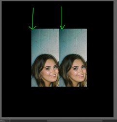
A section of the image of the woman's head on the left and the background wall above. This is just two identical Layers in PS so identical tones and colors. Either change the viewing magnification or click on the image so you see it full screen. Note where the green arrows are, some will see the wall tone gradient on the right image a bit darker than the tone gradient on the left image. In fact, Some will see the tone on the face on the left as a slightly brighter and warner tone than the one on the left (it can be subtle for some too):

Screen Shot 2021-11-21 at 11.24.12 AM.jpg


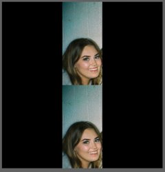
Below is a screen shot where which has the same two Layers in PS yet one on top of the other. With this perspective, that perceived difference and tone go away.

Screen Shot 2021-11-21 at 11.25.22 AM.jpg

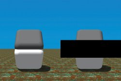
That is caused by an optical illusion name the cornsweet effect.

The image below shows the effect quite dramatically. The tone chip on top looks darker even though it is not. I duplicated the image to the right and only put a black bar across the transition area that shows they are the same tone.

Hard to believe yet put you finger over the transition area on the image on the left and voila, the perceived difference in tone goes away.


Cornsweet-illusion.jpg


Again, just to reiterate, the difference that @JeffK was seeing was real as meausred by color pickers, I just wanted to point out that you also have to be careful when viewing images side by side for optical illusion effects as well.

John Wheeler
 
Optical illusions are my specialty! I've also learned long ago that you have to step away from the screen for a while to rest your eyes to avoid burnout. Not that I always pay attention to the lessons learned. :)

I've changed some of the settings in Firefox color management but still not getting close. As I wrote before, MS Edge is a dead match. Oddly, the Firefox version in my tablet is closer in color than the Firefox on my laptop. I'm losing confidence that this is fixable - when doing color work, will just have to switch over to Edge to proof.

As far as the color profile in PS, I do try to avoid changing the profile as submitted in the original OP post. That's also a lesson learned while seeing a color shift when I was changing all to Adobe 1998 out of my old print file habits. Also depends on what the final use is although we're usually not given that by the OP.

It's a struggle of conflicting technologies...

- Jeff
 

Back
Top