Photoshop Gurus Forum
Welcome to Photoshop Gurus forum. Register a free account today to become a member! It's completely free. Once signed in, you'll enjoy an ad-free experience and be able to participate on this site by adding your own topics and posts, as well as connect with other members through your own private inbox!
You are using an out of date browser. It may not display this or other websites correctly.
You should upgrade or use an alternative browser.
You should upgrade or use an alternative browser.
Specific Color change
- Thread starter imran
- Start date
GeneGraphics
Guru
- Messages
- 817
- Likes
- 579
JeffK
Guru
- Messages
- 2,668
- Likes
- 3,100
@GeneGraphics - I'm curious - both are PNG files with the same RGB values. Why is one orange brighter than the other?
- Jeff
- Jeff
GeneGraphics
Guru
- Messages
- 817
- Likes
- 579
JeffK
Guru
- Messages
- 2,668
- Likes
- 3,100
@GeneGraphics - comparing your image on transparent background with my image on a transparent background. It's odd - as they appear on this site, they look different. But if I go back into PS and lay one on top of the other, they're the same. Could just be the way the site is rendering the two. I guess this is a "never mind" moment...thanks for responding though!
thebestcpu
Guru
- Messages
- 3,328
- Likes
- 3,071
The issue is that they are in different color spaces (one is sRGB by @GeneGraphics and the other is Adobe RGB by @JeffK ) yet using the same color number specified by the OP. That produces a different visible color when using color managed software.
Note that using Hex numbers to specify color numbers is based on the assumption that the color space is sRGB. So @JeffK, yours has the wrong color as the Hex numbers were applied in Adobe RGB.
That's my take.
John Wheeler
Note that using Hex numbers to specify color numbers is based on the assumption that the color space is sRGB. So @JeffK, yours has the wrong color as the Hex numbers were applied in Adobe RGB.
That's my take.
John Wheeler
JeffK
Guru
- Messages
- 2,668
- Likes
- 3,100
@thebestcpu - I dug deeper into this since the technical aspect is beyond me. You're right, John - hex numbers are generally associated with sRGB workspaces. I also read that even if you save a file, in Adobe RGB, browsers will ignore that and display it as sRGB - but that washes out the colors. All which equates the difference in the colors of the two images.
I've always had the habit of converting the images I work with to an Adobe RGB workspace. I'll have to think about that more carefully. Although I'm sure things get sticker as you go deeper.
I did find a good article that gave me some insight into the issues:

 petapixel.com
As I always say, every day is a school day!
Thanks to you and @GeneGraphics for the lead-in to the lesson!
- Jeff
I've always had the habit of converting the images I work with to an Adobe RGB workspace. I'll have to think about that more carefully. Although I'm sure things get sticker as you go deeper.
I did find a good article that gave me some insight into the issues:
Why You Should Probably Use sRGB
When I first started using Adobe Camera Raw, one of the options I experimented with was which color space the resulting JPEG should be in. Not thinking it
As I always say, every day is a school day!
Thanks to you and @GeneGraphics for the lead-in to the lesson!
- Jeff
MentosCubing
Power User
- Messages
- 293
- Likes
- 398
@thebestcpu is right, but I took a screenshot and sampled the colours of both images as they appear on the web page. They seem indistinguishable even then (I placed them right next to each other and couldn't tell the difference, even with a better monitor than the one I normally use), although they do have very slightly different hex values. So while that explanation is technically correct, I have a different theory on why they look different.@GeneGraphics - comparing your image on transparent background with my image on a transparent background. It's odd - as they appear on this site, they look different. But if I go back into PS and lay one on top of the other, they're the same. Could just be the way the site is rendering the two. I guess this is a "never mind" moment...thanks for responding though!
You've used different methods to do *almost* the same thing. The fill colour of the text is identical, but there is one key difference.
@GeneGraphics's image has smooth edges with proper interpolation; I'm guessing this was done by using the existing alpha channel data in the image as the mask for a solid colour fill layer. You can do this with a clipping mask. (It's also possible that Gene has simply used a Hue/Saturation adjustment layer to convert the black into the desired orange, but that's not the typical way to do it.)
@JeffK, your edit has jagged, aliased edges, Every pixel's alpha value is either 255 or 0; there's nothing in between. I think that instead of using the existing alpha values as a mask for an orange solid, you selected all the opaque black pixels, filled those pixels with orange, and deleted all the other pixels (the ones that were partially transparent). You should not do this because it creates an angry contrast between the background and foreground, and you've decreased the quality of the transparency data from the original image.

In these tiny cropped versions that I've blown up to make the difference more apparent, the colours also appear much farther apart. If I use my hand to cover the left side of the images, leaving only the harsh edges on the right side visible, they look like the same colour to me.
This may or may not be the reason for the difference in appearance, but if nothing else, take it as just a bit of general Photoshop advice for jobs like this. ^^
I found redoing the fonts easier too. Lots of adjustment on characteristics of individual characters was needed. It is not exactly the same, because the original font used is "Felix Titling MT" for the large characters which is a paid font whereas I used a free font that is similar. The text underneath is Bookman Old Style.

@IamSam It looks like the font you used has sharper Serifs. What font did you use?

@IamSam It looks like the font you used has sharper Serifs. What font did you use?

1 is taken from @GeneGraphics image
2 is taken from @JeffK image
3 is taken from @IamSam image
4 is taken from @polarwoc image
At the outset, I observe that @JeffK's image is Hex #FF7600 (CMYK 0, 67, 100, 0 or RGB 255, 118, 0) instead of Hex #E87500 (CMYK 6, 65, 100, 0 or RGB 232, 117, 0), which should answer the following question:
Why is one orange brighter than the other?
JeffK
Guru
- Messages
- 2,668
- Likes
- 3,100
At the outset, I observe that @JeffK's image is Hex #FF7600 (CMYK 0, 67, 100, 0 or RGB 255, 118, 0) instead of Hex #E87500 (CMYK 6, 65, 100, 0 or RGB 232, 117, 0), which should answer the following question:
This seems to have caused quite a controversy - but as I dig deeper, I'm learning a bit more about colors space. So first, thank you to all for offering some analysis.
Regarding the hex color, the RGB equivalent to e87500 is R232 G117 B0. I pulled all of the images into PS. All of the submitted work, including mine, had the same RGB values. But the assigned workspace changed:
@GeneGraphics had an RGB value of R232 G117 B0 - profile assigned is sRGB
@IamSam had an RGB value of R232 G117 B0 - no profile assigned (untagged RGB)
@polarwoc had an RGB value of R232 G117 B0 - no profile assigned (untagged RGB)
my image had an RGB value of R232 G117 B0 - profile assigned is Adobe RGB
Going back to John Wheeler's - @thebestcpu - explanation, web browsers usually change the profile of the displayed image to sRGB. This will wash out the color of an Adobe RGB file. Not sure how an untagged RGB profile would display but seemed there was no color shift in the browser.
So, my own thinking is that the color shift is primarily due to the assigned workspace in my file.
My admitted mistakes:
1) I used a select-and-fill to change the color of the type;
2) I should have left the original sRGB profile and not changed it to Adobe RGB.
My only explanation for #2 is that I come from a print background. The workspace generally used for print is Adobe RGB. So I've developed this habit of converting all images to Adobe RGB when I open them in Photoshop.
I truly appreciate all the attention paid to this issue - the technical can be just as fascinating as the aesthetics of PS.

- Jeff
Jeff, I opened your image on my PS, used the Eyedropper Tool and opened the Info Panel and this is what I observe:
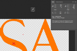
The sampled point is where the cross is. The G value fluctuates between 117 and 118.
I checked my settings while saving as PNG and this is what I found:
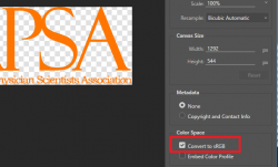
I had the "Convert to sRGB" ticked.

The sampled point is where the cross is. The G value fluctuates between 117 and 118.
The web browser is not involved in the process, yet my PS sees the RGB as 255, 117/118, 0. This means the colour was not RGB 232, 117, 0 at the time of saving the PNG itself....web browsers usually change the profile of the displayed image to sRGB. This will wash out the color of an Adobe RGB file.
I checked my settings while saving as PNG and this is what I found:

I had the "Convert to sRGB" ticked.


