Photoshop Gurus Forum
Welcome to Photoshop Gurus forum. Register a free account today to become a member! It's completely free. Once signed in, you'll enjoy an ad-free experience and be able to participate on this site by adding your own topics and posts, as well as connect with other members through your own private inbox!
You are using an out of date browser. It may not display this or other websites correctly.
You should upgrade or use an alternative browser.
You should upgrade or use an alternative browser.
Circles
- Thread starter rossi22
- Start date
- Messages
- 23,906
- Likes
- 13,636
In older versions of Ps this used to be a simple process using step and repeat. In newer versions the process has now become much more involved. There are a few different ways of creating the circles. For me, the only way to do this is to make everything editable!
Ps now has an annoying bug that removes shape properties from any duplicated shape. In some versions you can access shape properties with the Path Selection Tool.............this does not work in my current version of Ps. The shapes can be edited in the tools options bar. Another annoying problem is that when you do edit/change the shape size, it has to be moved back into alignment.
I see that you joined PSG back in 2012...................what version of Ps are you running now?
I will continue to experiment until I can find the best technique for creating this effect. I will get back with you. I have some questions with Adobe that I'm waiting for answers on.
- Messages
- 23,906
- Likes
- 13,636
I choose a large document to work on. This is 3000px x 2500px. Work big as you can always scale down.
We will be working with shapes so that they can be edited.
Set up horizontal and vertical guidelines in the center of the document.
I use a Solid color fill layer for my backgrounds...........easy yo quickly edit.
On a new layer, let’s choose the Ellipse Tool and create a 2000px x 2000px round ellipse/circle. Call this a template and lower it’s opacity.
Set guidelines to “snap” and add 4 more guidelines to top, sides, and bottom.
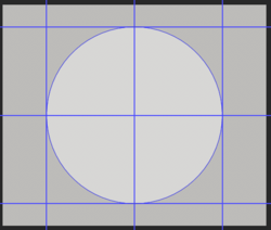
On a new layer, using the Ellipse Tool again, create (drag) a 80px ellipse while holding the shift + Opt/Alt keys to center.
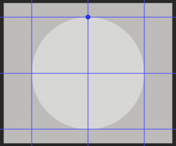
Duplicate that shape layer.
Now choose the Move Tool.
With the duplicated/copy layer selected/highlighted, hit Cmd/Cntrl + T to enter free transform. Hold down the Opt/Alt key and click once in the dead center (guidelines) of the large ellipse. Release the key. Now hold down the Shift Key and place your cursor on the corner of the transform box until you see a curved arrow appear. Now drag to the right two spaces (or just one space if you want them closer). Let go of everything.
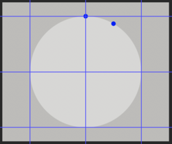
Now we are going to step and repeat. Hold down the Shift + Opt/Alt + Cmd/Cntrl keys at the same time and press the T key 10 more times.
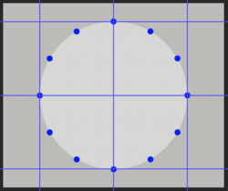
You should now have 12 individual ellipse layers. Place them in a group.
You can use the Path Selection Tool…………or you can use the Ellipse Tool while holding the Cmd/Cntrl key to make a selection of the ellipse shape layers as you work your way around the circle. Choose a shape layer, then in the tools options bar, add 20px, 40px, 60px, etc…to each shape progressively.
With my Ps, the added pixels will move the shapes out of position, so you will have to use the Path Selection Tool to drag them back into position using the circle template as your guide. The positions will change because we are making the shapes larger.
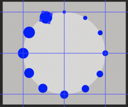
Turn off the circle template, the background color, and remove (or hide) the guidelines.
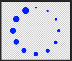
This method allows you to edit all of the individual shapes if needed within the PSD file! All that you need to do now is to save the PSD.
Any changes can then be made to the circles if needed.
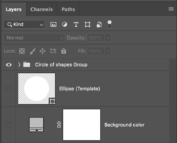
Just add Text or any other effects.

I will add that there are other ways to do this…………..this is only the easiest example I could think of using shapes that would be editable. I didn’t try to explain how you could use smart objects………….thats another tutorial!
We will be working with shapes so that they can be edited.
Set up horizontal and vertical guidelines in the center of the document.
I use a Solid color fill layer for my backgrounds...........easy yo quickly edit.
On a new layer, let’s choose the Ellipse Tool and create a 2000px x 2000px round ellipse/circle. Call this a template and lower it’s opacity.
Set guidelines to “snap” and add 4 more guidelines to top, sides, and bottom.

On a new layer, using the Ellipse Tool again, create (drag) a 80px ellipse while holding the shift + Opt/Alt keys to center.

Duplicate that shape layer.
Now choose the Move Tool.
With the duplicated/copy layer selected/highlighted, hit Cmd/Cntrl + T to enter free transform. Hold down the Opt/Alt key and click once in the dead center (guidelines) of the large ellipse. Release the key. Now hold down the Shift Key and place your cursor on the corner of the transform box until you see a curved arrow appear. Now drag to the right two spaces (or just one space if you want them closer). Let go of everything.

Now we are going to step and repeat. Hold down the Shift + Opt/Alt + Cmd/Cntrl keys at the same time and press the T key 10 more times.

You should now have 12 individual ellipse layers. Place them in a group.
You can use the Path Selection Tool…………or you can use the Ellipse Tool while holding the Cmd/Cntrl key to make a selection of the ellipse shape layers as you work your way around the circle. Choose a shape layer, then in the tools options bar, add 20px, 40px, 60px, etc…to each shape progressively.
With my Ps, the added pixels will move the shapes out of position, so you will have to use the Path Selection Tool to drag them back into position using the circle template as your guide. The positions will change because we are making the shapes larger.

Turn off the circle template, the background color, and remove (or hide) the guidelines.

This method allows you to edit all of the individual shapes if needed within the PSD file! All that you need to do now is to save the PSD.
Any changes can then be made to the circles if needed.

Just add Text or any other effects.

I will add that there are other ways to do this…………..this is only the easiest example I could think of using shapes that would be editable. I didn’t try to explain how you could use smart objects………….thats another tutorial!
thebestcpu
Guru
- Messages
- 3,216
- Likes
- 2,963
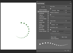
Another approach to consider that may be less precise and takes more fiddling yet is quick and easy is to create a circular path (can be done with Shape Tool) and stroke that path with a round brush with the spacing turned up in Brush Tip Shape and the Size Jitter under Shape Dymanics set to Fade. Easy to undo and change the initial size, spacing amount, and fade amount to tune it to what you want. Example image below.
Just another approach to consider
John Wheeler
Just another approach to consider
John Wheeler

- Messages
- 23,906
- Likes
- 13,636
Thanks John, the technique you describe was one of the first I had considered!
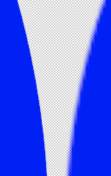
But since I did not explain my reasoning above, I will do so now. I realize that Photoshop is not the program for creating logos, but with design and logo work being a consideration based on the OP's example, a brush stamp on a path (while very editable) is raster content only and not the vector content of a shape layer that's normally used in logos. While there's little difference in the initial look of either technique, you will get much more desirable results with vector based shapes when scaling, which is why I chose to go with a little more difficult technique in using shapes.
Example:
The shape (vector) on the left scaled up and the Brush Stamp (raster) set to 100% hardness on the right scaled up.

thebestcpu
Guru
- Messages
- 3,216
- Likes
- 2,963
Thanks John, the technique you describe was one of the first I had considered!
But since I did not explain my reasoning above, I will do so now. I realize that Photoshop is not the program for creating logos, but with design and logo work being a consideration based on the OP's example, a brush stamp on a path (while very editable) is raster content only and not the vector content of a shape layer that's normally used in logos. While there's little difference in the initial look of either technique, you will get much more desirable results with vector based shapes when scaling, which is why I chose to go with a little more difficult technique in using shapes.
Example:
The shape (vector) on the left scaled up and the Brush Stamp (raster) set to 100% hardness on the right scaled up.
Good catch and I totally agree IamSam
As an alternate, I would also use a decent size canvas as you already mentioned, use the same approach I mentioned in my post to create the dot pattern in raster with the brush tool, and go back and just use the ellipse tool over each dot of the pattern to convert it into paths or a shape.
This also allows to have the circular dots to be created with decreasing spacing as in the OPs original example and have the advantage of shapes/paths (as you mentioned) for sharp edges at any size.
Just another thought on how to proceed
John Wheeler


