What's new
Photoshop Gurus Forum

Welcome to Photoshop Gurus forum. Register a free account today to become a member! It's completely free. Once signed in, you'll enjoy an ad-free experience and be able to participate on this site by adding your own topics and posts, as well as connect with other members through your own private inbox!

CHALLENGE 6 - "Emotional Manipulations".


Status
Not open for further replies.

Inkz

Guru
Messages
2,358
Likes
1,554
CHALLENGE 6 - "Emotional Manipulations".

First off, I would like to thank you all that voted for me on the last challenge, and because of you lovely people, I'm hosting this challenge.

Emotional Manipulations.

Deadline 15/12/2012

I chose this challenge, as most of you who know me, I have a passion for emotional manipulations and I would like to see how you guy's do on the subject.

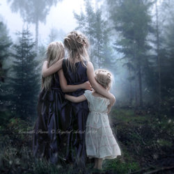
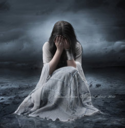
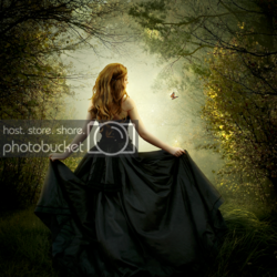
Here are a few images for inspiration by one of my favorite photomanipulators.

Credit to http://aeternum-art.deviantart.com/

rapture_by_senderos_olvidados-d5iskp7.jpg


d5dc0e601445ddcd6223183beed033ff-d58nwtf.jpg

68634d45df92fbd75ff2ac5ee7372907-d566aw2.jpg

Ok, so you got the idea for this now.

I don't have any specific tutorials for you guy's to follow, but here is some useful info to help you along.

http://www.surrealpsd.com/tutorial-index/


Have fun shoppers.​
 
Alright Inkz. Looks like the challenge will be in creating a unique expression of emotion. Well, not to downplay the manipulation, the PS part! After all . . . :mrgreen:

I'm looking forward to the entries. Thanks for the very Inkz-Style Challenge.
 

Attachments

  • photo_manip.png
    photo_manip.png
    4 MB · Views: 7
Beautiful color mix Jessica. I actually think the lighting is a bit too much on the lady. Her shadow may be at a slightly different angle than those cast by the grass. But more importantly, when you zoom in, you can see that there needs to be a harder and darker shadow to anchor her foot to the ground. Also, under the folds of the gown you should see shadowing. The other point is the sharpness/blur of the grass and the girl do not match. One of the secrets of a really good manipulation is getting things to blend so that they look naturally part of the same scene.

And no, I don't think I'm expert at that, lmao. Hardly. But those are my observations. I think it is a moving image.
 
Thanks Clare, I will try to fix these inconsistencies. I guess it wouldn't be fair to edit my submission, so I'll leave that as is and just edit it for myself.
 
Thanks Clare, I will try to fix these inconsistencies. I guess it wouldn't be fair to edit my submission, so I'll leave that as is and just edit it for myself.

If you want to edit your work, go ahead, deadline is the 15th so edit away or even do more submissions.

Your emotional manip is beautiful and you can feel the emotion within the picture. Great work. Just maybe blend the model in more to the background. Just lower the saturation a little.
 
If you want to edit your work, go ahead, deadline is the 15th so edit away or even do more submissions.

Your emotional manip is beautiful and you can feel the emotion within the picture. Great work. Just maybe blend the model in more to the background. Just lower the saturation a little.

Cool beans. I'll work on it some more and maybe enter another if I have time :D
 
Yep, Inkz said we can enter more than one.
Here's my updated version. I desaturated her (possibly too much?), blurred the edges to blend more in to the background, added a different shadow and more shadows on the dress, and last but not least, blurred her slightly so she wouldn't be so sharp.

Made use of my tablet that I haven't used in forever for the shadows. The pen pressure really helped on that part. I have some more stocks I've saved so I will definitely be making another!
 

Attachments

  • photo_manip2.png
    photo_manip2.png
    1.1 MB · Views: 3
Nice entries so Far :)

oh my how did I miss this. Count me in. PC now working roughly as it should so expect my entry (ies) soon hehe.

Very nice challenge Sir Inkz :cool2: :thumbsup:
 
I'm thinking about this challenge..........so many choices!

Jessica - Your composition speaks to me! I like it! But the image is a little too dark.

Chitkaran - Interestingly disturbing. I prefer the first version. Did you add the fence over the young girls face or was it included in the original photo reference?
 
Last edited:
I'm thinking about this challenge..........so many choices!

Chitkaran - Interestingly disturbing. I prefer the first version. Did you add the fence over the young girls face or was it included in the original photo?


Thanks Sam... The fence was originally there.. I just corrected the texture of it to make it more worn out and rusty...
 
Nice work Jess...

So pleased you used your olde tablet lol. I look forward in seeing more of these from you within the challenge and hopefully outside this challenge.
 
so many bEEutifffull entries in such short time! you peeps r so quick! :shocked:

my brain GPU is lagging again :banghead: :D
 
Status
Not open for further replies.

Back
Top