What's new
Photoshop Gurus Forum

Welcome to Photoshop Gurus forum. Register a free account today to become a member! It's completely free. Once signed in, you'll enjoy an ad-free experience and be able to participate on this site by adding your own topics and posts, as well as connect with other members through your own private inbox!

C&C


I had trouble posting the images... Took only one and refused to see the other as different.

Bad link???? I checked it, it works. It gives access to the web directory root.
 
After

After.jpg
 
Last edited:
It is hard to see when you're scrolling from one to the next, can you put it side-by-side? The only difference I see is maybe saturation and adage of cloud's? Is that it?
 
No, that is not it, I did not work on saturation at all. I worked with channels to gain back details in both highlights and black areas.

The problem I have is in making selections (the simplest thing AH!).

When comparing images, I usually do it with two images and flip them with ACDSee or any other fast viewing software.

As to the side by side, I have no clue. Can you point me to an example?


Thanks.
 
Your link is good...my bad, but I don't normally see a root. I do like the clouds but the whole image seems dark, I would mask the sky out now and work on the white building.
 
Your link is good...my bad, but I don't normally see a root. I do like the clouds but the whole image seems dark, I would mask the sky out now and work on the white building.
The white building color is accurate...
As to the whole image being darker than expected... I cannot make up my mind on that. Noting your remarks thought.
 
I was second guessing myself and my glasses were on!:banghead:
 
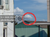
Looks like tree top to me?
It is indeed a tree top also on the corner of the roof. I let them 'grow' to add realism to the sky as I have learned that perspective is important when modifying the sky...

Now the real problem is the selection mask as I completely missed some parts. :banghead:
 

Back
Top