It's not as bad as you say. Don't be so humble!!
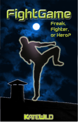
I think the foot is in need of work; it looks artificial and not planted on the roof and I think I can see the rooftop line through it which doesn't seem like the intention since you can't see the sky through the body (though seeing a faded out sky might not be a bad idea.
The sky could use a gradient mask so it looks a bit more like the above cover. Lessen the high clouds as they come down and maybe even brighten the BG sky a bit as you would see in a city. That's where multiple gradients or even a radial starting just above the rooftop and slightly behind the figure could work. Just an idea.
Also, we can't see the full size, you might want to make it bigger for the forum. The Kate Wild looks too fuzzy, maybe the outer glow is too much. If you want to use that, try increasing the space between the letters (found in the character panel: AV). Maybe the title and subtitle could use a bit of finagling. I don't think their relative size needs to be as drastic as the first example, but I like that the subtitle is in a smaller font.
Now, this next thought is strictly an artistic choice. I would, on the title text only, increase the neon effect of the color. I would change the gradient on the figure to be more bold but not by much and I would vary the glow which would probably have to be done by making selections and copying to layers to change that or adding radial glows behind the figure, lower layers.
I really like the rest, the idea, the layout. I apologize if my critique seems to contradict what I said about the book cover being good. Don't think that. I'm wordy anyway, but I believe the more you think, consider, and have the courage to try alterations, the better. Duplicate, make a copy of the state you're in now, then play with it. Don't destroy the stages you think are plateaus in your work. At least that is my advice.
Cheers and keep it up; you're headed in the right direction IMO!!


