What's new
Photoshop Gurus Forum

Welcome to Photoshop Gurus forum. Register a free account today to become a member! It's completely free. Once signed in, you'll enjoy an ad-free experience and be able to participate on this site by adding your own topics and posts, as well as connect with other members through your own private inbox!

blending edges/ fixing color disparities


Messages
8
Likes
1
hey everyone!

im designing a sketch for an album cover right now and I have trouble fixing the transitions around the background areas since i created the frame very poorly as i now noticed :rolleyes:
Is there a way to make the transition from grey to white more seamless? i havent found a way to blend them over without destroying the sharpness of the textures :/

thanks in advance!
 

Attachments

  • aaam.jpg
    aaam.jpg
    4.2 MB · Views: 2
Hi - Welcome to PSG. Glad to have you here.

Unfortunately, it's not clear to me exactly which areas you want to have smoother transitions. I think I know, but could you confirm it by either circling, or putting arrows to several examples of areas that need blending in that image.

Thanks,

Tom M
 
Glad I asked. Those weren't the areas that I thought.

Just to confirm, I see an annular (more or less) white ring, and then many, (more or less) rectangular brush strokes come radially inwards towards it from the edge of the image. From the arrows you placed, it seems like you want the ends of the brush strokes to be more gradual where the ends of the brush strokes themselves are more or less circumferential, not radial.

Is that right?

Cheers,

Tom M
 
If my previous supposition was correct, have you simply tried painting irregular radial gradients of gray in those areas on an otherwise white layer mask.

T
 
PS - BTW, I have to run in a few minutes, but I'm sure someone else will pick up this discussion. I'll be back later tonight.

Tom
 
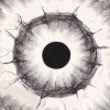
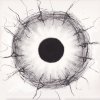
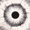
Actually these arent brush strokes, its a scan of a charcoal painting I did. Then, I added the outer frame by copying pieces of the inner ring.
The frame consists of copied parts that I took from the inner circle. the outer circle is supposed to be a kind of reprise of the inner one.
 
Here,
the first pic is the original scan, then in the second pic I tried to add the frame but the unfortunate seams around the edges when going from the added parts to the original came up there.
I dont want to lose the sharpness of the original charcoal style but want blend them over somehow.
 

Attachments

  • hm.jpg
    hm.jpg
    3.3 MB · Views: 1
  • aaam2.jpg
    aaam2.jpg
    4.3 MB · Views: 2
For me, the problem is in the color variations.....
Screen Shot 2016-03-29 at 1.19.36 PM.png


....which can only be fixed with the Brush Tool, and it's not a great solution.
Screen Shot 2016-03-29 at 1.21.40 PM.png
 
I created a circle of color that I sampled from the outside of the inner/original image.
Screen Shot 2016-03-29 at 1.35.02 PM.png

Screen Shot 2016-03-29 at 1.38.04 PM.png

I then set it's blending mode to darken.
Screen Shot 2016-03-29 at 1.35.34 PM.png

This solved most of the problem areas except for the lower left corner.
 
Wow, okay thats perfect. It´s exactly what I wanted to achieve. I think I can repair the lower left corner manually by just using the dodge and burn tool. Could you maybe send me your version in the orginial resolution? :lol:
 
I made a selection of the corner.
Screen Shot 2016-03-29 at 1.56.10 PM.png

And filled it with a sampled color from the corner.
Screen Shot 2016-03-29 at 1.56.59 PM.png

I set the blending mode to darken and lowered the opacity to 68%.
Screen Shot 2016-03-29 at 1.57.36 PM.png

I cleaned up the edges with a layer mask.....could have done better.....working fast.
Screen Shot 2016-03-29 at 1.57.51 PM.png

Made a stamp visible layer and then desaturated.
Screen Shot 2016-03-29 at 1.58.11 PM.png

The lower left corner could use some Brush Tool work but it looks better.
 
It looks waaay better. The lower left corner still has some issues but I think I can brush those out, I found a brush preset that imitates the charcoal texture quite well.
 
So sorry.................I wasn't even paying attention!! I did not realize this was a free request!

Sure, this was as far as I went.
aaam_01.jpg
 
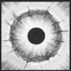
Here's a crazy alternate approach to Sam's: Use either a B&W adjustment layer or a Hue/Sat adjustment layer to adjust the luminosity of the more pink areas to match the luminosity of the lesser pink areas, and then desaturate (and then possibly tint) the entire image.

Obviously some touchup work would have to be done on this approach, as well, particularly if you want some texture into the texture-less areas, but maybe it's less overall work. If you are interested, I can make screen grabs of my layer stack and the adjustments in the hue/sat layer.

Tom M
 

Attachments

  • Sam's_close_up-tjm01-ps02a-698px_wide_for_GIF.gif
    Sam's_close_up-tjm01-ps02a-698px_wide_for_GIF.gif
    351.6 KB · Views: 8

Back
Top