What's new
Photoshop Gurus Forum

Welcome to Photoshop Gurus forum. Register a free account today to become a member! It's completely free. Once signed in, you'll enjoy an ad-free experience and be able to participate on this site by adding your own topics and posts, as well as connect with other members through your own private inbox!

Black & White Photo Compositing Question


MattBall

New Member
Messages
3
Likes
0
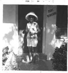
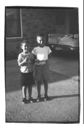
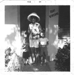
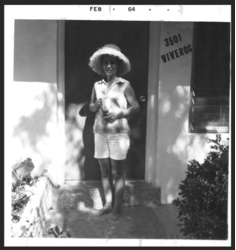
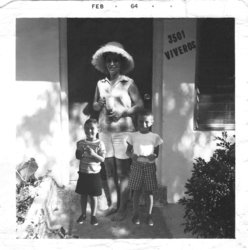
Okay, so I have this black & white Kodachrome photo of my mother in which she is standing alone at the entrance to our house in Florida in 1964, and I have a contemporary photo of my brother and I from a month before in the back yard in slightly different light, but close enough to allow me to cut and paste the figures of us into the photo of my mother to make it appear we are standing alongside her on the walk in front of the house. There is however the slightest mismatch in the three layers that give away the compositing. Is there anything I can do, some simple trick to improve the blending of the layers without adversely affecting the resolution or image definition. I am currently getting excellent reprints from image exports to TIFF and JPG files and I would like to preserve that level of quality.
 

Attachments

  • Mom in Lake Forest Save - 1.jpg
    Mom in Lake Forest Save - 1.jpg
    807.3 KB · Views: 0
  • Rocky & Guy.jpg
    Rocky & Guy.jpg
    465.6 KB · Views: 0
  • Flattened In Work Mom Guy & Rocky in Lake Forest.jpg
    Flattened In Work Mom Guy & Rocky in Lake Forest.jpg
    3.8 MB · Views: 0
Hello and welcome.

Here are just a few issues that you might address.

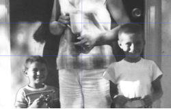
Look at the height difference in this image.....
Screen Shot 2018-03-05 at 5.23.09 PM.png

...compared to this image. You have made the younger boy too small for his proportions.
Screen Shot 2018-03-05 at 5.23.17 PM.png

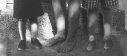
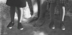
Here, the boys legs and shoes are out of focus compared to the Mom who's legs and feet are in focus.
Screen Shot 2018-03-05 at 5.23.32 PM.png

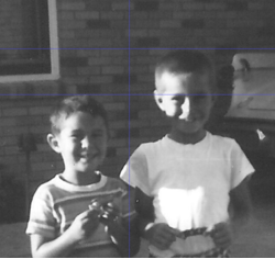
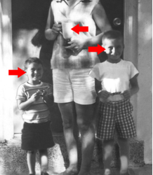
There are some issues with the selection of the boys, but this dark line on the younger brothers right (our left) is the biggest issue.
Screen Shot 2018-03-05 at 5.23.57 PM.png

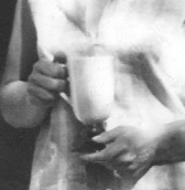
Take a look at the lighting on the moms glass, it's from our right. This shows the direction of the lighting of her photo.......
Screen Shot 2018-03-05 at 5.30.22 PM.png

It's the complete opposite of the lighting on the boys which comes from our left.
This also makes the shadows on the boys look off.
You need to turn the boys around (reverse).
Screen Shot 2018-03-05 at 5.38.28 PM.png
 
I agree, all your suggestions and observations are valid, especially the proportion of the borhters to one another and easily corrected. There is not much I can do about the quality of focus wiht whihc the original source picture was taken. Same with the direction of the light as they were derive from a phot take at a different angle (maybe I could flip the figures left to right - that would put the light on the 'right' side). But, have you any suggestion as to the composit blending issue? Or do you think eliminating the issues you pointed out will go the long way toward alleviating blending issue?
 
There is not much I can do about the quality of focus wiht whihc the original source picture was taken.
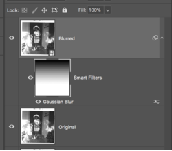
Nonsense. You can add a soft focus to the bottom of the original image simulating that of the boys images. Duplicate the the original, convert to a smart object, use a Gaussian Blur smart filter (adjustable), add a conceal all layer mask or just use the smart filters mask, use the Brush Tool or the Gradient Tool on the layer mask to add the blur.

Screen Shot 2018-03-06 at 8.59.48 AM.png
Screen Shot 2018-03-06 at 8.59.58 AM.png

Same with the direction of the light as they were derive from a phot take at a different angle (maybe I could flip the figures left to right - that would put the light on the 'right' side).
Yep.......I already suggested that..."You need to turn the boys around (reverse)."

Or do you think eliminating the issues you pointed out will go the long way toward alleviating blending issue?
Yes. Already stated that......."but this dark line on the younger brothers right (our left) is the biggest issue."
 
Like so... and the dark line dissapears with the flip. Now, I have to more closely examine your suggestion; '...add a soft focus to the bottom of the original image simulating that of the boys images. Duplicate the the original, convert to a smart object, use a Gaussian Blur smart filter (adjustable), add a conceal all layer mask or just use the smart filters mask, use the Brush Tool or the Gradient Tool on the layer mask to add the blur' I will work on it tomorrow. Thanks for the input.
 

Attachments

  • Mom Guy & Rocky in Lake Forest.jpg
    Mom Guy & Rocky in Lake Forest.jpg
    3.8 MB · Views: 0
The upper halves of the boys bodies looks fairly good. The boy on our left still needs some work, he's way too dark and not blending like the boy on our right.

It's the lower half now that needs the attention. The brighter highlights on the boys legs and shoes do not look natural. The angle of their feet/shoes is off slightly compared to Mom's feet. They need some contact shadowing so they don't appear to be hovering.
Screen Shot 2018-03-06 at 9.55.56 AM.png
 
Now, I have to more closely examine your suggestion;
Before blurring.....
Screen Shot 2018-03-06 at 10.04.28 AM.png

After adding smart blur...... (this blur is slightly stronger for demonstration purposes)
Screen Shot 2018-03-06 at 10.04.42 AM.png

Since I used a gradient, the upper half of the image is not affected.
 

Back
Top