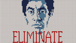
Let me backtrack a couple of steps: The main problem that I see here is that we are attempting to work from a screen-shot version of the image:
(a) whose pixel dimensions are considerably larger than that of the original artwork; and,
(b) which contains annoying pixel grid lines that happen to be (even more annoyingly) fuzzy.
Because of (a), even if one down-rez'es the given image to the true pixel dimensions, there is no guarantee that there will be perfect registry between the well defined pixel grid in your current workspace with the pseudo pixel grid shown in the artwork, so there are going to be all sorts of problems in getting brushes and other tools to be placed correctly.
Because of (a) and (b), I took a different approach.
My first step was to ingest the image through ACR and use the controls there to ensure a neutral gray background, brighten the dark areas and saturate the colors in the original.
Next, I changed the preferences in my PS to use nearest neighbor interpolation everywhere in PS that might be relevant, and turned on "snap to grid".
I then used the quick selection tool ("auto enhance" MUST BE turned off to work correctly) to select each of the different colored areas, red, light blue, and dark blue. The following shows a "walking ants" display of the union of three areas of color immediately after using the quick selection tool:

I then made a mask for each colored area, and using the pencil tool at a sub-pixel radius, touched up any spurious pixels, turning them white or black, as appropriate. Fortunately, these were almost all clustered around the edges of the areas, so there weren't all that many to fix:

I then poured red into the area defined by the preceding mask and got essentially a perfect version of this section of the image, ie, absolutely straight edges, the annoying pixel grid lines removed, no spurious edge pixels. This was at exactly the same pixel dimensions as the original, but since the OP asked how to enlarge this, as my final step, I used the "image size" command (in "nearest neighbor" mode) to enlarge it by a factor of 4 (ie, about 2500 px wide instead of the original 102 px wide in the 1st post). As you can see, it enlarged well, with sharp edges preserved. I put it on a black background instead of the original white background because I felt that this would show any anomalies (eg, fuzzy edges, erroneous pixels, etc.) better than on a white background. Obviously, the color of the background is trivial to change.

(Double click on it to see it at the full, 4x pixel dimensions.)
I'll leave it to the OP to do the other colors.
HTH,
Tom M
PS#1 - I found absolutely no problem in filling pixels by clicking anywhere vaguely near the center of the pixel, not on the top left corner, as MrTomM experienced.
PS #2 - The issue of the two meanings of the word, "resolution" is, once again, raising it's ugly head here. @
MrToMM, I would *strongly* urge you (as I mentioned in my private message to you a month or two ago) to replace all occurrences of the word, "resolution" with either "ppi", or "pixel dimensions". Doing so sets a good example as well as makes it crystal clear exactly what aspect of the image is being discussed.
For the OP's benefit, depending on the context, the word, "resolution" can mean either the "ppi" setting used in Photoshop, OR the dimensions of the entire image in pixels (ie, how much information an image can contain). Hopefully pointing out this ambiguous meaning clarifies MrTomM's closing statement that resolution does not mean how big an image is. Clearly, "ppi" does not tell one anything about how big an image is (ie, the pixel dimensions"), but when, for example, used in the common meaning of the term, a "higher resolution" camera obviously will have more pixels (ie, larger pixel dimension images). Such confusion is why I am so adamant about using more precise terminology than the ambiguous term, "resolution".


