What's new
Photoshop Gurus Forum

Welcome to Photoshop Gurus forum. Register a free account today to become a member! It's completely free. Once signed in, you'll enjoy an ad-free experience and be able to participate on this site by adding your own topics and posts, as well as connect with other members through your own private inbox!

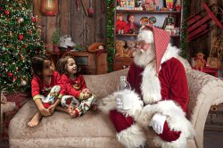
Best way to blend photo into an image?


xxnonamexx

Active Member
Messages
25
Likes
1
I would like to know the best way that I can blend an image so it appears it was really there. I am trying to learn how to make my kids appear as if they are really sitting on the chair and it appears its almost there but still a little "fake" test.jpgAny help greatly appreciated.
 
I think yours is generally pretty good. One thing I noticed is that Santa is very sharply focused—you can see individual hairs in his beard; the edges of his clothes are sharp—but the kids are slightly less focused. The outline of the kids' bodies seems soft and feathered. I'm not sure how you made the selection of them, but you may want to use the Pen tool (for everything but their hair) to get a sharper edge. Then possibly try sharpening the kids a little.
 
Another thought: Try deforming the couch cushion under the kids to make it look like it sags under their weight. I spent only 5 seconds on this, but you get the idea.

test2.jpg
 
Couple more suggestions in addition to @Rich54 -
- Raise the girls higher so it looks as if they're sitting deeper on the couch. The girl on the left looks as if she's about to slide off the edge
- Add shadows underneath the girls so they don't look as if the floating. Look at Santa's shadow on the couch
- I added some sharpening overall
You may have to correct the lighting a bit to match Santa...

A quick edit:

santa and sisters edited.jpg
 
I did not have much time to work on this yet here is what I added.
The key is to try and match everything else in tone, color, sharpness, noise, and especially lighting
A very wide soft shadow around the girls similar to the shadow around Santa.
I took the girls and made the shadows darker, added clarity, increased contrast, slight adjustment to vibrancy, increased sharpness and texture.santamilkshadows-adj.jpg

The selection I did was not too accurate (you can tell on the left girls hair) and also did not work on the let foot that is sticking out to the left side of the image. It has shadows that have no match with what should be in the image.
 
it looks more realistic then what I was trying. I am no guru with photoshop but trying to learn. I used the match color under adjustments thought that helps blend photo into background colors. I forgot about the shadowing.
 
it looks more realistic then what I was trying. I am no guru with photoshop but trying to learn. I used the match color under adjustments thought that helps blend photo into background colors. I forgot about the shadowing.
There's this old joke -
Guy walks up to another man on the street and asks him "How do I get to Carnegie Hall?"
The man answers "Practice...practice...practice."
I only started working with PS regularly a short while ago. One thing I learned is that those first few months, it's all about muscle. Learning those tools, pushing images around, making big moves. But as you learn more, it's also about the subleties. It's not just what you do, it's also understanding why you're doing it that way. Placing the kids on the couch is a good move. You have to learn that and you did. But now comes the subleties - the lighting, shadows, etc. That's practice - finding out the ways and whys of getting things done.
PS is an astounding program. It's as much technology as creative art. You asked some good questions - keep asking them. You can't find everything in tutorials. Use your eyes as well as your hands. It will come to a point when you look at other images and you'll see those subleties. You'll have that "aha" moment and then start building that into your own images.
A journey of a thousands miles starts with a single click... ;)
- Jeff
 
The kids are too green, added levels layer and set Output to 233 for Green channel. Added some shadows and a little sharpenning.
girls.jpg
 

Back
Top