What's new
Photoshop Gurus Forum

Welcome to Photoshop Gurus forum. Register a free account today to become a member! It's completely free. Once signed in, you'll enjoy an ad-free experience and be able to participate on this site by adding your own topics and posts, as well as connect with other members through your own private inbox!

Beginner after some feedback


smokeys_13

New Member
Messages
4
Likes
2
Hi Guys,

One of your classic beginners here, no photoshop training or photography background, just like playing around with it and seeing what I can do - manipulation and touch ups being my favourite things to do. I thought I'd post some examples of some of the adjustments I think have turned out well and you guys can tell me where I've gone wrong and/or what could be improved (though I think they look okay, you experts will no doubt spot things I have overlooked).

Apologies for the layout, seems like image thumb control isn't available with this editor.

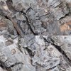
Random bark image - blending edges
original.jpg

mine.jpg

Tiger's head - enhancements
original.jpg

mine.jpg

Old bridge - enhancements
original.jpg

mine.jpg
 
Cheers, I think I may have slightly overdone the sharpening on some of the leaves in the last example and maybe the water droplets, but I just loved the contrast in the image with the little highlights picked out from the sunshine.
 
*** Image Arrangement ***

Before I give any feedback on the images, if you go into advance mode, you will find an inline check box for your images and you can organize them wherever you want to place them.
 
Ok, I don't exactly understand what is going on with the bark images, so I will leave them alone.

Of course, there is always room for improvement no matter how far along you are. We're not all perfect artists either nor do we always see everything when we get focused on an idea.

On the tiger, I would have worked selectively to bring the lower half of his head into better focus and to enhance the color. I would also have selected the eye and sharpened it considerably and added highlights to bring the sense of it forward. It would help if you learned more about the gamma, and the other slider adjustments/histograms, because you have blown out some highlights and lost some of the delicate texture and detail of his ruff.

On the arch and waterfall, you did a lovely job of making the waterfall sparkling and clear. You have, however lost the subtle tan color of the brick and I don't think the alteration to all grey works very well. Once again you have blown out highlights. In this picture, I think it is a result at least secondarily of sharpening, which always increases - to whatever small or great extent - the brightness of edges (use the smart sharpen or unsharp mask or Camera Raw, so that you have control over the edge details, the lower the number the less light on edges but less sharpening as well). You have unfortunately taken a well-balanced image and made it washed out and sharp-edged. Granted, the original image lacked clarity and was flat. But you have overdone some areas and neglected others.

That said, I think for someone with no experience and a self-described total newbie, you are making good use of the tools available. It is clear that you are exploring the many options. Bravo. Throughout my life, I have at first flinched at critique, feeling it was criticism (let's not get into psychoanalysis here guys. I've done enough of that!), but it is the meat of improvement in any craft. So please take it in the spirit of help and believe me when I tell you, I've been there, done that, and often still do that if not in the same manner!

Keep up the good work and keep posting. :thumbsup:
 
Last edited:
In light of your final paragraph I personally feel that critique and criticism are the same thing, it is how those criticisms are expressed and the willingness to learn of the person that receives that criticism that makes it helpful critique. Luckily I see your notes as very helpful critique and will hope to learn from them. I will primarily apply the appropriate notes to the images above and try again from scratch. Then try to drill the new information into my head so that future work sustains the same standard.

I can't seem to see a link/button for editing a post either - am I blind or will I just have to make sure future posts are arranged properly and leave this one as it is?

Thanks for all your help and input (plus the time involved in doing so!)
 
I can't seem to see a link/button for editing a post either - am I blind or will I just have to make sure future posts are arranged properly and leave this one as it is?

You should see it in the bottom right corner of your post -- right next to reply.

It's possible that you don't get edit privileges until you reach 5 posts, though. I don't know about if that's a rule or not as I'm a newbie like yourself.


2013-01-23_14-25-26.png
 

Back
Top