Iseestarsnewdemons
Member
- Messages
- 17
- Likes
- 1
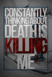
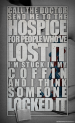
 So for the first picture as well as the second, how do you all blend the textures onto the words well because I mask it on or clip the texture onto the text and it always turns out bad which is what I did in the third picture, I darken the texture and duplicate the texture and clip that on the text so it is lighter and it still looks odd especially when I apply blending modes. Now I did obviously rush on cutting out the person, but I usually use the quick selection tool so it still looks a bit off, so is the eraser tool better to use as shown in the fourth photo to get the girl cut out perfectly? And those are my questions, about the texture of the text and how to blend it and how to cut out specific parts of artwork of an album cover well and how to wrap anything around the text such as locks as in the second picture, so I really need help on answering those questions because no matter what I do, it turns out like the 3rd picture. I need steps and pictures so I can see your workflow and how you all do these lyric edits, thankyou!


