What's new
Photoshop Gurus Forum

Welcome to Photoshop Gurus forum. Register a free account today to become a member! It's completely free. Once signed in, you'll enjoy an ad-free experience and be able to participate on this site by adding your own topics and posts, as well as connect with other members through your own private inbox!

Background edit


Dziga74

Well-Known Member
Messages
135
Likes
28
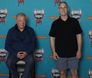
I need advice as to remove the logos in the background while maintaining the natural texture and lighting variances so it looks natural and not just a flat color. I'm not a novice but am self taught so I have some gaps in my knowledge. Please be as specific as possible. Thanks very much.

IMG_4234-gigapixel-low_res-scale-2_00x.jpg
 
Current versions of Photoshop (my version is very old) have a lot of new AI-assisted filters. There may very well be a button called "Remove Logos But Keep it Looking Natural", which will get you very far toward your goal. I don't have (or want) those and I'm not very familiar with what's new in Photoshop. That said, here are some thoughts for doing things more manually.

I think that if you tried something like the Clone Stamp over each individual logo, it would be a tedious nightmare and you'd have a very hard time matching all the tonal variations in the blue wall. Instead, my approach would be to make a careful selection of the two people (including Shatner's chair), isolate them on their own layer, and then rebuild a new blue wall below them.
  • Select the two men and put them on their own layer. This will be the top layer. Ignore their cast shadows for now.
  • On a new layer below that, sample the dark blue at the bottom of the wall and make that the foreground color. Then sample the lighter blue at the top and make that the background color. Use the gradient tool to drag-out a dark-to-light gradient from bottom to top.
  • A gradient by itself is too perfect and fake-looking. Above the gradient layer, create two Levels adjustment layers: one that slightly darkens the midtones and one that slightly lightens the midtones. Fill the mask of both Levels layers entirely with black.
  • First, use Levels to darken the areas between the legs of each man because those are in deep shadow.
  • You now want to simulate the ambient light of the room reflecting on the wall in irregular ways. Using a very large, soft brush with the Flow set to about 5%, examine the original image and look for areas of shadow or light. For example, the upper-right corner seems darker to me, and the area between the two men—at about shoulder height—seems a bit lighter. Look for things like that and—using your Levels adjustments—create some ambient imperfections to the gradient.
  • I don't see much texture in this particular wall, but there are many ways to introduce texture. One way is to use the same dark and light blue colors as in your gradient, and create a new layer of fibers (Filter>Render>Fibers). Change the layer blend mode to Soft Light and lower the opacity down to maybe 20%, so that the fiber streaks are just barely perceptible.
  • This particular wall is designed to be a photo backdrop, so by definition it is supposed to be fairly evenly lit and very boring. Optionally, you can introduce stains, grain, grunge effects... there are endless choices for background textures to liven things up.
  • Lastly, go back to the two men and add a drop shadow layer style. Use the original image as a guide for the light direction, size and intensity of the shadow.

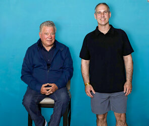
Here's what I get after doing all that. (Note, I made a very sloppy selection of the two men.)

New Wall.jpg
 
Not sure what version of Photoshop you have, but I decided to try Adobe AI tools to see how that would work
- First selected the two guests without their shadows, and using the quick selection tool an pen tool - then placed them on a separate layer without the background.
Let's call this the subject layer.
- Gong back to the original base layer, I selected the two subjects again and then used Generative Fill to take them out of the background.
-Then I combined the generative fill layer and the background layer so now I'm just left with the icons and logos on this background layer
- Using the remove tool, I began "erasing" them from the background until I was left with only the blue background.
(occasionally I had to apply the remove tool more than once to finish the job)
- Now I've got one layer with only the subjects and one layer with the background
- I duplicated the subject layer and placed it underneath the original subject layer. We'll call this the shadow layer.
- Then, holding own the Ctrl key (CMND on Mac) I clicked on the mask of the shadow layer - that selected the 2 figures.
Then I clicked on the thumbnail.
- Going up to the menu bar, I went to Edit-Fill and filled the underlying figures with black. You won't see this since it's underneath the subject layer.
- Using the move tool, I shifted the black filled area to the right to create a hard shadow. Then went to Filter-Blur-Gaussian blur to blur the shadow and reduced the opacity until I got
a drop shadow.
- Then combined all layers so I have a single image.
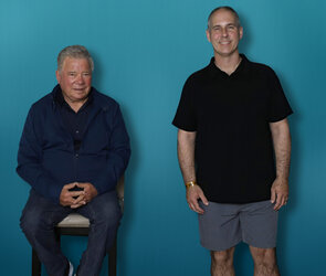
- Then using the content aware move tool, I shifted Capt. Kirk and his shadow over to the man on the right.Then put it through camera raw for quick color adjustment

Could use a bit more refinement. I understood there were different ways to address the image - this was my first try. Took some work but
I learned a few things along the way myself. :)

kirk and vip edited.jpg
 
Last edited:

Back
Top