Photoshop Gurus Forum
Welcome to Photoshop Gurus forum. Register a free account today to become a member! It's completely free. Once signed in, you'll enjoy an ad-free experience and be able to participate on this site by adding your own topics and posts, as well as connect with other members through your own private inbox!
You are using an out of date browser. It may not display this or other websites correctly.
You should upgrade or use an alternative browser.
You should upgrade or use an alternative browser.
Astroida's thread
- Thread starter Astroida
- Start date
ibclare
Queen Bee
- Messages
- 11,033
- Likes
- 4,638
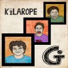
Fun stuff. In the first one, the letter "C" - I assume it's a "C" - is difficult to identify at first glance. I would make it appear more ike the others. I think you can do that without sacrificing too much of the lines through it. At least that's my thought. Maybe make the D and the C larger. I like the Kilarope. Should I know what the "G" stands for? LOL. As for the 3D, that is nice. I think there should be more room to the right of the word racing, similar to the space on the left. It feels cramped, and unless you want it to appear that it's leaving the page, that's what it looks like. Keep up the good work. Would like to see more as you make it.
- Messages
- 23,874
- Likes
- 13,629
Hey Astroida, very nice work! The first one is very creative and very busy. The color is not my favorite but if you like that's all that counts! Nice layer styling on the second. Kilarope seems personal and lacks meaning for normal viewers, but very well done! The last 3D is probably my favorite. I agree with Claraby though, very cramped. Great work! Can't wait to see more!
Astroida
Member
- Messages
- 22
- Likes
- 5
Thank you for the input. Kilarope is actually hip hop band from my town, so I did this cover for them. They didn't tell me what the G stands for, but I sold them this cover so who cares.  If you are interested here is a link to their soundcloud profile https://soundcloud.com/kilarope
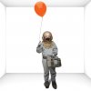
As for 3D, it was my first try, but it came out quite nicely. And yeah, I started a new project last night so here is a first draft. I would like to ask for critique how to make it more realistic.

As for 3D, it was my first try, but it came out quite nicely. And yeah, I started a new project last night so here is a first draft. I would like to ask for critique how to make it more realistic.

- Messages
- 23,874
- Likes
- 13,629
No, I just used transform.
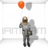
1. After I separated the dude, I duped the little goomer and filled him with black.

2. I entered transform mode, comd/cntrl + T, then right clicked and chose distort.

3. Then I moved the shadow where I wanted the first (lower) part to lay. When done I hit the check mark/enter.

4. I then grabbed the Rectangular Marquis Tool (RMT) and made a selection of the upper part of the shadow. I want the lower line to be even with the bottom of the room. I then hit cmd/cntrl + J to duplicate the selection to a new layer.

5. I then selected the duped selection, highlighted the previous layer and hit delete to remove the upper portion of the shadow.


6. I then selected the newly duped layer of the upper shadow and transformed it to where I wanted it.

7. I then repeated the same steps to alter the top of the balloon.

8. You should have three layers for the shadow. Merge these layers.

9. Finally, move the newly merged shadow layer below the goomer layer and add Gaussian blur, adjust the position if needed.

Done.
1. After I separated the dude, I duped the little goomer and filled him with black.

2. I entered transform mode, comd/cntrl + T, then right clicked and chose distort.

3. Then I moved the shadow where I wanted the first (lower) part to lay. When done I hit the check mark/enter.

4. I then grabbed the Rectangular Marquis Tool (RMT) and made a selection of the upper part of the shadow. I want the lower line to be even with the bottom of the room. I then hit cmd/cntrl + J to duplicate the selection to a new layer.

5. I then selected the duped selection, highlighted the previous layer and hit delete to remove the upper portion of the shadow.


6. I then selected the newly duped layer of the upper shadow and transformed it to where I wanted it.

7. I then repeated the same steps to alter the top of the balloon.

8. You should have three layers for the shadow. Merge these layers.

9. Finally, move the newly merged shadow layer below the goomer layer and add Gaussian blur, adjust the position if needed.

Done.


