Photoshop Gurus Forum
Welcome to Photoshop Gurus forum. Register a free account today to become a member! It's completely free. Once signed in, you'll enjoy an ad-free experience and be able to participate on this site by adding your own topics and posts, as well as connect with other members through your own private inbox!
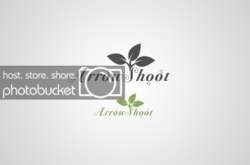
Arrow Shoot Logo Concept.
- Thread starter Inkz
- Start date


 I think this is the best one yet I really like the S sprouting off to a leaf, that's cool ( I would suggest closing the gap a bit to align by bringing it(the leaf) a px or two higher and closer.