What's new
Photoshop Gurus Forum

Welcome to Photoshop Gurus forum. Register a free account today to become a member! It's completely free. Once signed in, you'll enjoy an ad-free experience and be able to participate on this site by adding your own topics and posts, as well as connect with other members through your own private inbox!

Any Sugestions?


Peaches Of The Night

Well-Known Member
Messages
69
Likes
15
Hi :) I made this for the game I play, My AO of Pack is very happy with it & is using it for our Pack announcement. BUT I would really like some input from you guys. Thanks so much!!!
 

Attachments

  • Workin on STFU.jpg
    Workin on STFU.jpg
    169.7 KB · Views: 83
I would make the dogs larger - by a lot. And change the sizes of the different words more and move them away from the edges on the side. Right now they seem like they're scattered really randomly and to me, that takes away from the overall design. I would make the RAWR larger. Nice concept!

If you post the psd with all the layers, I can give you an idea of what I mean. If you like.
 
Last edited:
Thank You ibclare, View attachment Workin on STFU.psd not sure if it did it, if not I will ask for help. Good it looks like it did :) maybe not I dont understand what happened :(
 
Last edited:
OK Peaches. I opened it and played with it. I'll attach the psd so you can see what I did. I didn't have all your fonts, so I substituted. Also, it appears you flattened the background so I had to work around that. I found two wolves to show the wolf/dog and arranged them, position and size. If I were in the mood, lol, I would have cloned out the paw prints. Then I would put new ones in and move them downward.

White space, the space all around the image is very important to consider in any image. So I have changed some sizes and moved them around. I thought your title disappeared into darkness, so I brightened that. Look at the psd for how I resolved the problem, not that you need do the same thing on your own project.

The names at the bottom are probably too small for your liking and that is easy to change. I have them all linked together in my copy of the psd, but on yours, you can position them (with your chosen font intact) however you want. I suggest that they 1) be moved away from the edges, 2) be arranged in an interesting manner so that they play off each other, and 3) line them up from the edges so that they all are oriented to the same spacing away. Do the same thing with all the edges as you did with the pawprints.

That's all, she says.

Workin on STFU.jpg
 
Let me add, when you open my psd, be sure to see the layer blending modes and opacities (on the wolves and the stfu) as they are important. Also I added hue saturation adjustment to the stfu and changed the color. Then I changed the layer blending mode to linear dodge, the brightest, lightest mode, and adjusted the opacity.

View attachment 37453

Please let me know if this attachment opens as a psd as it doesn't say so. I can upload it to a 3rd party site. It opens for me, but it's my upload so I would expect that. It may be too large, but I was able to download yours obviously. If you have a problem, I'll research why that is. Meantime, like I said, I'll put it up on an image sharing site.
 
Last edited:
I got this Message when I tried to follow your link Invalid Attachment specified. If you followed a valid link, please notify the administrator
 
OK, I think it's on now. I made it a little smaller. Yours loaded OK so it shouldn't have been necessary . . . I've had this problem before with just jpegs.

Thank You!! I was waiting to see if what I had messaged earlier came through but it did not SOOO
What you did was GREAT!!! I really like it :lol: A few of the things you did I have never done at all yet BUT I will learn. The layer blending mode sounds & looks interesting. Again Thank You!!!
 
Yes it downloaded this time if I may ask how do you do that Line thing over the image?? It is a good thing to know :wink:
 
I am thinking if you follow what ibclare told you. I have compared your two psd and the second one is better. I'm imagining if those two dogs were stepping on big paw image.
 
Line thing? I can't say I know what you mean. If you are referring to the fur crossing over their paws and rumps, it is done by cloning, using the stamp tool. If you haven't ever tried it out, I would suggest watching tuts, then playing around with it. The one advice I would stress is to try to choose a path for the cloning that doesn't come from adjacent to the area you are filling. Otherwise it will look like copied pixels when you want a natural effect.
 
Thank you ibclare, you are being very patient with me & that means a lot to me. It is Buck Hunting season here & I have been hunting & not using Photoshop :( ( no deer yet darn it) The season is over Wednesday Night the 9th & then I will be able to continue leaning be here more. You know so much about what Photoshop has to offer & that impresses me lots!! ;) I started with no knowledge about Photoshop at all about 2 months ago lol NOW I know I just starting to scratch the surface of an amazing Program!! Have a GREAT Day!!!


Opps almost forgot I meant the security lines that run through the image :0 it would be something I need to learn how to do :)
 
Last edited:
The typographical hierarchy needs a fair bit of work. You need to decide which words are going to be your headers, and which are your sub headers, in other words, which words/sentences will be the largest, and which will be the smallest. Traditionally, the largest are at the top, but it doesn't always have to be so. At the moment, all the fonts are too equal in size and styling for any of them to be dominant. Generally dominant text should be the name or well known slogan of the product/entity you're trying to "sell".

Also give some thought to the colours. Right now, I can see you've used red to highlight a lot of text. If you stick to using the red to highlight the most important text, then it will have much more impact, and stand out on its own. Currently, the highlights are a bit lost in a sea of other highlights.

Study note: Google articles on typography. Its really helpful in creating a layout which both catches and guides the eye in the correct manner.

Here's a link to get you started with the basics: http://www.noupe.com/design/a-crash-course-in-typography-the-basics-of-type.html

And a more advanced page of type tutorials when you're ready: http://www.creativebloq.com/graphic-design-tips/typography-tutorials-1232719
 
WOW I never thought of that & it makes the image a lot more "real" for lack of a better word. Thanks ibclare :)
 
Hummm "Rubbing Head" I understand what you are saying Spectum & I thank You for that advise & the links also I haven't gone to it yet BUT I will. I seem to have to use "cheaters" (I call them) ways to do or say things because of the TBI. One of the things is my lack of depth perception The wreak took it away & so I have to find "cheaters" to do what I use to do with out thinking &&& Well like what I was told in this forum about my picture & the things I need to learn to be able to do it better :( NONE of these things even entered my mind till I was told. SOOO I have to figure out a way to do the wording so others see them like you just said even if I cant. WOW sorry I tend to get side tracked & lose my train of thought. THANK YOU!!! for saying these things to me. People in my RL dont seem to get it, I NEED to be told or I will not see/know it :)
 
Hummm "Rubbing Head" I understand what you are saying Spectum & I thank You for that advise & the links also I haven't gone to it yet BUT I will. I seem to have to use "cheaters" (I call them) ways to do or say things because of the TBI. One of the things is my lack of depth perception The wreak took it away & so I have to find "cheaters" to do what I use to do with out thinking &&& Well like what I was told in this forum about my picture & the things I need to learn to be able to do it better :( NONE of these things even entered my mind till I was told. SOOO I have to figure out a way to do the wording so others see them like you just said even if I cant. WOW sorry I tend to get side tracked & lose my train of thought. THANK YOU!!! for saying these things to me. People in my RL dont seem to get it, I NEED to be told or I will not see/know it :)

No problem :) 
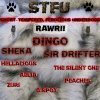
I didn't think much about typography 5 years ago either, but its something that is often overlooked as an important part of design, even by some professional designers.
 
Peaches, I agree with Spectrum. The priority could be emphasized more and made to stand out.

So, for instance is the stfu or the rawr the header? If it is the name of the organization, then you might consider moving the ferocious line above the stfu and make sure it is larger than the rawr.

You could also consider giving the names varying sizes to give just the slightest illusion of depth. More can be done to suggest that, but I think it would compete too much with the overall design, which IMO is already too busy. You could remove or diminish the red around the ferocious line so it doesn't grab as much attention, but still gets the point across. You could decrease the opacity of the background, not as low opacity as a watermark, but to make it compete less with the text and make the overall impression more powerful in keeping with the message of the words. Put a white filled layer below the current BG if you do that if you are planning to put it on anything other than white.

Just some ideas to consider. Things which Spectrum made me think about.
 
I am done Hunting & have deer meat for the winter :) Now back to learning, Let me explain a little on the wording of what I posted, The Pack I am in is called [STFU] Short-Tempered, Ferocious Underdogs The [STFU] is in front of our names for all to see mine is [STFU] Peaches, RAWR is just what we wolfs do I guess, I just using it cause I want to lol ;) Since I made it there has been changes, 2 members have left the Pack so I need to take there names off the (banner) not sure what it called, G-Spot & Zuri. Opps side tracked again. I will do it over & post it here so I can get more of the GREAT advice I have been getting. I will try to use the advice I have been given when I do it.
 

Back
Top