What's new
Photoshop Gurus Forum

Welcome to Photoshop Gurus forum. Register a free account today to become a member! It's completely free. Once signed in, you'll enjoy an ad-free experience and be able to participate on this site by adding your own topics and posts, as well as connect with other members through your own private inbox!

any creative style ideas for these fly logo pictures?


Tom-75

Well-Known Member
Messages
65
Likes
1
Hi,

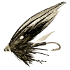
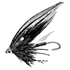
I am planning to create a logo for which I want to use some version of the below salmon fly pictures.

The top one is the original photograph but but already extracted from the background and converted to BW.

the second one is actually my favorite but maybe I would like it with a little more orange.

Anyway if somebody has some nice creative ideas for the style of this fly-logo, please let me know. Since it is a logo it should not be too detailed and shoudl also have nice contrast etc on a dark background.

logotest-fly.png

Regards,
Tom
 
I think you need a better example of a fly before anyone works with this or gives an opinion. This one has poor resolution and the selection is not very good, much of that the result of the image quality.
 
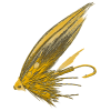
If you want this, it's a png. I made it while doing laundry. Seems like a bit more productive than washing clothes, if not more necessary! I don't mean to insult your work, but the image is small and difficult to do anything from. I even find it hard to recognize at first glance and that is important for a logo. My png is not all that great, selections of this type are not the easiest and I used a feather brush here and there.

This one will be more difficult - well, not by much - to make into line art as ibis suggests. I like that suggestion if you must use the one above. God, I'm opinionated!

Now, one question, how are you using this as you want it desaturated?

fabrizio.png
 
Hey! extra rinse cycle, what can I say?!

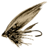
Maybe this will serve as an example of what you could do. Or maybe it will serve as an example of what you should not do . . .

fabrizio.jpg
 
How will this logo be used (text, background image, etc) and do you have a color pallet in mind for the overall image you're trying to produce? All these things affect one another to produce a nice looking image so consider these to inform your color choice for this logo.

flylogoresult.jpg
 
Last edited:
Nice picture :)

I think it will mainly be used in front of photographs as logo and I would like it work nicely with dark backgrounds. Color wise I have some orange in mind such as ffcc33. I am actually quite happy with the second picture but thought maybe a little more could be nice.

Also wanted to see if somebody maybe has some really special or different ideas for this style-wise.

Regards,
Tom
 
You all have a keen eye on design, as I browse through the entire page all I see was creativity, and for sure making logo is really hard because every once in a while a bright and a nicer idea came up and you have to change it. I have met guys who have logos ideas through amazing-logos.com/building-logos and they helped me a lot but am on a tight budget now so I want to do this on my own. But just want to say that though I have to pay for the logo that I want, because I myself can't do something like that so vivid, I am satisfied, I just love seeing a lot of logos being made by creative people.
 

Back
Top