What's new
Photoshop Gurus Forum

Welcome to Photoshop Gurus forum. Register a free account today to become a member! It's completely free. Once signed in, you'll enjoy an ad-free experience and be able to participate on this site by adding your own topics and posts, as well as connect with other members through your own private inbox!

Altering skin tones and clarity for old portrait paintings


Ovi Sergiu

Member
Messages
12
Likes
4
Hello!
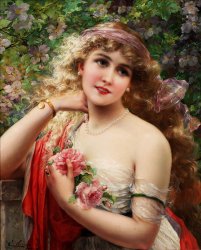
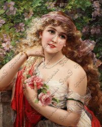
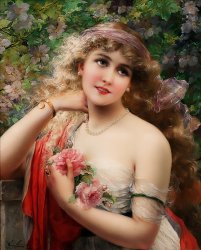
Could you, please, have a look and tell me what did they do to the original picture so they obtained a cleaner version?
(I numbered the pictures attached: 1 original from Wikipedia, 2 retouched version by someone).

My untrained eye saw this:
- the retouched version got rid of the shadows from chin, arms, red dress,
- I think they put a lot of Sharp (everything is so much clear)
- they faded the colors (see lips, see skin tone)

Could you please if you manage to reach their level and then tell me what did you do?
Thank you!

1 original emile vernon -la printemps from wikipedia.jpg

2 retouched.jpg
 
i made a a closer/detail look and i dont think he used the same program, maybe a similar program or maybe he used real pictures that match to blend, like the pearls, nose etc,

Him redrawning some parts its also a possibily XD.
 
To be honest, it is hard to compare too much in my opinion.
The original is JPEG with quite a few JPEG compression artifacts and the retouched version is highly compressed so the quality is hidden and I cannot tell if the painting cracks are still there or not or if the desired result was to eliminate them or retain them.
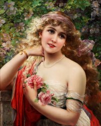
Here is a version I did on pretty short order
- Topaz JPEG to raw (no it does not create raw yet does a decent job of removing some of the JPEG artifacts)
- Topaz Denoise
- Photoshop Adobe Camera Raw touchup

So this was very little work and certainly with hand brushing / masking it would not be hard to tune it up much better yet thought just showing what existing automation can do as a starting point.
Hope this helps
John Wheeler

1-original-emile-vernon--la-printemps-from-wikipedia-adj.jpg
 
Hmmm, the colors look off on my iPhone so probably messed up on color profiles or something. Will check it out in the morning.
 
Well, I did not mess up on color profiles yet the end result of processing as I described did not end up with a should skin tone which felt quite right to me. I am not the best when getting skin tones right and was trying the basic paint over in another Layer with the blend set to Color. That did not quite appeal to me so decided to invest a bit of time to up my game a smidgen (I hope) in skin tone management.

I know others have used specific RGB or CMYK values (or ratio of values) as a guideline of what is close. There is no right answer as the color desired can depend on the mood desired or the surrounding elements in the image. The problem I had with using RGB and CMYK is that depending on the working space / ICC profile associated with the image, those guidelines can change.

So I followed a path that others have used in using Lab numbers which are absolute so there is no dependency on which specific working space you are in --- Lab is Lab and that's it.

However, painting with a blend mode of Color with other sampled skin colors in the image was also not satsifying.
So I investigated: How did the "L" "a" and "b" components correlate with each other for various skin points in the image. Note that I ignored the face to the first order as cosmetics change the natrual skin tone and that would not track with skin of other areas of the body that had no cosmetics.

For this particular image, it turns out that the "b" value was reasonalby constant yet the "a" component of color had an inverse relationship with the "L" component. So I thought, why not apply a Gradient Map adjustment Layer which would apply a skin color depending on the luminosity or the "L" component.
So in the image below, I created a gradient sampling different areas of "L" and placing the breakpoints in the custom Gradient Map at those same points. Note "L" values go from 0 to 100 and so does the positioning range of color points in the custom gradient. It was pretty easy as if I sampled a place on the image and then created a new gradient point, it would prepopulate the sampled color into the custom gradient.

Then all I did was start with an all black Layer Mask on the Gradient Map Layer and paint over the shoulder area. I felt pretty satisfied with the end result. Screen shot first below and then the full image with the should colors changed to reflect the gradient map in that area.

I hope that the explanation was clear enough yet could add more detials with images if desired.
I suspect that this technique was already in use elsewhere in some tutorial yet it was fun discovering it on my own and I will remember it better that way.
John Wheeler
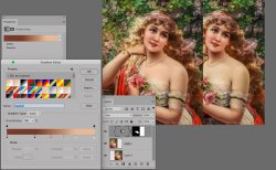
Gradient-Map-to-adjust-skin-tone.jpg


And here is the final image with the shoulder skin tones adjusted

Shoulder-skins-tones-adjusted-with-gradient-map.jpg
 
So finally upgraded to a Windows 10 laptop (Dell XPS 15) - which was within my budget - and was also able to finally upgrade to the latest version of Photoshop. Lots of new stuff I'm still playing with.
While bouncing around inside the software, it made me think of this painting. Although the newest filters weren't giving me what I wanted, the texture slider in the upgaded camera raw did, for instance.

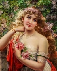
So worked on this painting and really only used:

- Initial curves adjustment
- Used high pass filter on duplicated layer and then changed to overlay
- Separated out the eyes and added a curve layer to them to brighten up
- Went to ACR and used the texture slider to smooth the skin out
- Duplicated the necklace from the original, placed it on the top layer, and added a brightness/contrast adjustment layer

So I guess you could say I went old school on the upgrade!

Not perfect but I think actually came out better than the retouched version posted by the OP.

Fun to work on...love these vintage portraits...

- Jeff
oil painting edited.jpg
 
He used remini, fast example withouth fixing the issues.
cheers!
Very nice result. Remini is an app. I guess you used Bluestacks on your computer to use Remini, right?

i made a a closer/detail look and i dont think he used the same program, maybe a similar program or maybe he used real pictures that match to blend, like the pearls, nose etc,
Him redrawning some parts its also a possibily XD.
Nope, not at all. On their blog, they wrote they have a Photoshop team.


To be honest, it is hard to compare too much in my opinion.
The original is JPEG with quite a few JPEG compression artifacts and the retouched version is highly compressed so the quality is hidden and I cannot tell if the painting cracks are still there or not or if the desired result was to eliminate them or retain them.
Here is a version I did on pretty short order
- Topaz JPEG to raw (no it does not create raw yet does a decent job of removing some of the JPEG artifacts)
- Topaz Denoise
- Photoshop Adobe Camera Raw touchup
So this was very little work and certainly with hand brushing / masking it would not be hard to tune it up much better yet thought just showing what existing automation can do as a starting point.
Hope this helps
John Wheeler
Very nice! I like it. I did not know about Topaz software but I will give it a try.
Could you please, tell me what „retouch” did you do in CamewaRaw?


Well, I did not mess up on color profiles yet the end result of processing as I described did not end up with a should skin tone which felt quite right to me. I am not the best when getting skin tones right and was trying the basic paint over in another Layer with the blend set to Color. That did not quite appeal to me so decided to invest a bit of time to up my game a smidgen (I hope) in skin tone management.
I know others have used specific RGB or CMYK values (or ratio of values) as a guideline of what is close. There is no right answer as the color desired can depend on the mood desired or the surrounding elements in the image. The problem I had with using RGB and CMYK is that depending on the working space / ICC profile associated with the image, those guidelines can change.
So I followed a path that others have used in using Lab numbers which are absolute so there is no dependency on which specific working space you are in --- Lab is Lab and that's it.
However, painting with a blend mode of Color with other sampled skin colors in the image was also not satsifying.
So I investigated: How did the "L" "a" and "b" components correlate with each other for various skin points in the image. Note that I ignored the face to the first order as cosmetics change the natrual skin tone and that would not track with skin of other areas of the body that had no cosmetics.
For this particular image, it turns out that the "b" value was reasonalby constant yet the "a" component of color had an inverse relationship with the "L" component. So I thought, why not apply a Gradient Map adjustment Layer which would apply a skin color depending on the luminosity or the "L" component.
So in the image below, I created a gradient sampling different areas of "L" and placing the breakpoints in the custom Gradient Map at those same points. Note "L" values go from 0 to 100 and so does the positioning range of color points in the custom gradient. It was pretty easy as if I sampled a place on the image and then created a new gradient point, it would prepopulate the sampled color into the custom gradient.
Then all I did was start with an all black Layer Mask on the Gradient Map Layer and paint over the shoulder area. I felt pretty satisfied with the end result. Screen shot first below and then the full image with the should colors changed to reflect the gradient map in that area.
I hope that the explanation was clear enough yet could add more detials with images if desired.
I suspect that this technique was already in use elsewhere in some tutorial yet it was fun discovering it on my own and I will remember it better that way.
John Wheeler
And here is the final image with the shoulder skin tones adjusted
Wow! Thank you for the explanation and I am glad you learned by discover.

So finally upgraded to a Windows 10 laptop (Dell XPS 15) - which was within my budget - and was also able to finally upgrade to the latest version of Photoshop. Lots of new stuff I'm still playing with.
While bouncing around inside the software, it made me think of this painting. Although the newest filters weren't giving me what I wanted, the texture slider in the upgaded camera raw did, for instance.
So worked on this painting and really only used:
- Initial curves adjustment
- Used high pass filter on duplicated layer and then changed to overlay
- Separated out the eyes and added a curve layer to them to brighten up
- Went to ACR and used the texture slider to smooth the skin out
- Duplicated the necklace from the original, placed it on the top layer, and added a brightness/contrast adjustment layer
So I guess you could say I went old school on the upgrade!
Not perfect but I think actually came out better than the retouched version posted by the OP.
Fun to work on...love these vintage portraits...
- Jeff
I will definitely try and reproduce your steps. It looks very nice!

I am so happy you got close to what I first post/wanted.
The retouched version (from my fist post) is used in a cross stitch program that reduces the painting to 200 colors.
If I use the original photo in the cross stitch software, I get pixelated results and weird colors.
With my untrained eye, I noticed that retouching gives me a smooth and better result in the cross stitch software.
 
Hi @Ovi Sergiu

Here are the steps I took in PS ACR:

Here are the changes through ACR

Basic section
- Reduced Highlights
- Reduced Shadows (slider to right)
- Increased Clarity
- Slight increase in Vibrance

With Adjustment Brush
- Decreased shadows around both eyes and added blue tint
- Decreased shadows around neck area

Much more could be done yet was just trying to achieve your objective.

For the skin tone of the shoulder, I was sampling colors on lighter and darker parts of the arms to set up the Gradient Map on an additional Layer then just masked in the shoulder areas.

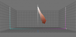
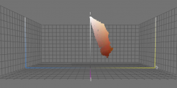
I have ColorThink Pro which allows viewing the pixel colors in Lab sapce for an image or the portion of the image you use as input to that program. Plotting that in 3D it shows the arm color and how it changes with Luminosity.

First here is the "a" channel of Lab and it shows the negative relationship with Luminosity (vertical channel):

Screen Shot 2021-04-09 at 9.01.23 AM.png

Following I turned the 3D image to show just the "b" channel of Lab

Screen Shot 2021-04-09 at 9.02.15 AM.png

A much larger width in B in colors with a smaller relationship with Luminosity.

I plan to use this methodology in the future as I am pretty sure of the many skin colors and lighting conditions the relationship of "a" and "b" with "L" will no doubt be different yet might yield a useful set of gradient maps over time for general use.
John Wheeler
 

Back
Top