What's new
Photoshop Gurus Forum

Welcome to Photoshop Gurus forum. Register a free account today to become a member! It's completely free. Once signed in, you'll enjoy an ad-free experience and be able to participate on this site by adding your own topics and posts, as well as connect with other members through your own private inbox!

Advice on Eliminating Person From Photo?


Status
Not open for further replies.

photoscoo

Active Member
Messages
35
Likes
15
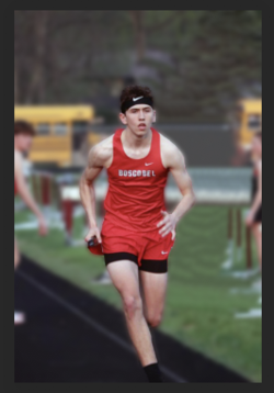
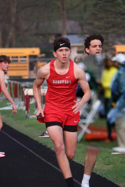
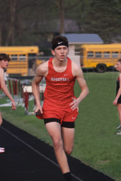
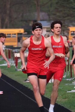
My neighbor wants to have a photo of their nephew edited. I told them I would try and help.

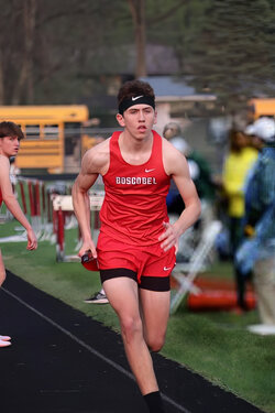
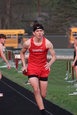
They want the second person removed from the photo. I've attached here how I did it using mostly the clone stamp tool. Can you guys maybe give me an idea on how I can do this better?

Any thought would be most appreciated!

Resized_FB_IMG_1652669017176.jpeg

Resized_FB_IMG_1652669017176 copy2.jpg
 
Notice to all members, this is a help request and not a request for it to just be done. Please respect what the OP has asked and give full explanations of work you may do on this image.

@photoscoo This is a rather difficult challenge you've taken on! It would be difficult to actually cover all areas. Is there a particular area that you would like to start with?

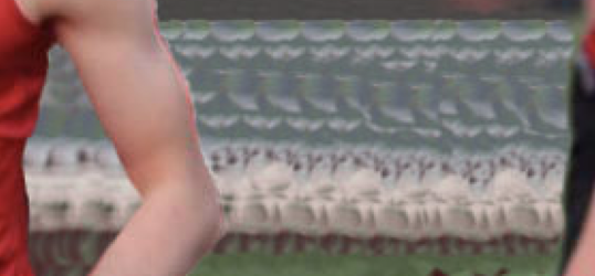
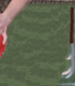
The main areas I see that you need help with is in Clone Stamp doubling...............this is where you keep sampling and cloning the same pixel structure over and over again.

Screen Shot 2023-02-19 at 3.27.26 PM.png
Screen Shot 2023-02-19 at 3.27.35 PM.png
Screen Shot 2023-02-19 at 3.27.43 PM.png
 
Thanks IAmSam. Yes I'm aware of the clone stamp doubling. I was going to blur the entire background, but for some reason I am unable to get the blur brush tool to work(?)

Layer is selected. Mode is Normal. Strength is 100%. It does nothing. Any ideas?
 
Thanks I just read your reply.

What I tried was doing a Select->All and then the blur tool worked. But it doesn't have a lot of range. I will try your suggestion.
 
Sorry........I edited my post above to include more detail.

Using this method, you can edit the blur and the layer mask at any time.
 
If you want more instruction on improving your techniques on removing object/persons from the background, I'm willing to help you out. Let me know.
 
Another approach ...
-duplicate the original
-select the main subject and add the selection to an alpha channel
-borrow spectators from the web
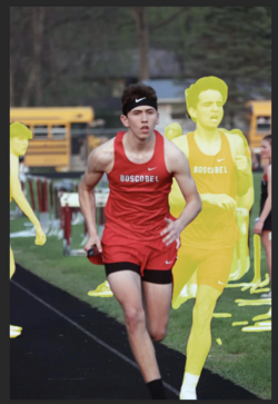
-place the spectators over the second runner and add a mask (first picture
- with this mask selected, ( the added in spectators layer) Ctrl-tap on the main subject alpha channel and hit Ctrl-Back to fill the selection. This way, the runner
has been masked out of the added-in spectators
- make the duplicate layer active and clone the remaining/visible portions of the second runner out.
- Merge the layers and add gaussian blur. With a mask and the alpha channel activated, you can now remove the blur from the main subject.

Spectstors-added.jpg

Runner.jpg
 
Another approach ...
-duplicate the original
-select the main subject and add the selection to an alpha channel
-borrow spectators from the web
-place the spectators over the second runner and add a mask (first picture
- with this mask selected, ( the added in spectators layer) Ctrl-tap on the main subject alpha channel and hit Ctrl-Back to fill the selection. This way, the runner
has been masked out of the added-in spectators
- make the duplicate layer active and clone the remaining/visible portions of the second runner out.
- Merge the layers and add gaussian blur. With a mask and the alpha channel activated, you can now remove the blur from the main subject.

Babine that is awesome. Thanks for taking the time to not only list the steps, but to also show me the results!
 
You've been given some great insights into process by both @IamSam and @Babine. Sometimes the process can be creative itself since Photoshop gives you many different ways to achieve similar things.

I took a shot at it and approached it primarily by cloning.

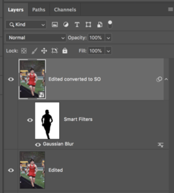
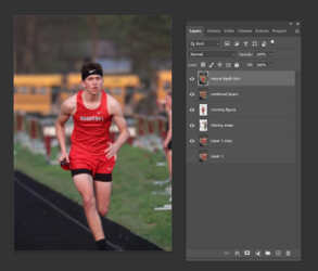
- First I selected and placed the runner I wanted to keep on a separate layer.
-Then underneath that layer, and above the original layer, I created a blank layer.
- In the blank layer I did all my cloning so that I could clone around and behind the runner without disturbing him since he was on a separate layer.
- Did some additonal cloning on the left side, created an additional bus in the back, and along the grass picking up separate bits and pieces to avoid doubling.
- Then I combined all layers by clicking Shift+Ctrl+Alt+E on Windows (should be Shift+CMND+OPT+E on the Mac)
- Now going up to the main menu at the top I opened Filter>Neural Filters>Depth Blur to blur the background leaving the runner in focus.

Here's the image with the layers panel showing my steps:

1676949488392.png

You can also separate the runner out of the image, and then blur the image as needed to created a depth of field.

Might need some additional cleanup with some patience.

Hope this helps and shows you another way.

- Jeff
 
You've been given some great insights into process by both @IamSam and @Babine. Sometimes the process can be creative itself since Photoshop gives you many different ways to achieve similar things.

I took a shot at it and approached it primarily by cloning.

- First I selected and placed the runner I wanted to keep on a separate layer.
-Then underneath that layer, and above the original layer, I created a blank layer.
- In the blank layer I did all my cloning so that I could clone around and behind the runner without disturbing him since he was on a separate layer.
- Did some additonal cloning on the left side, created an additional bus in the back, and along the grass picking up separate bits and pieces to avoid doubling.
- Then I combined all layers by clicking Shift+Ctrl+Alt+E on Windows (should be Shift+CMND+OPT+E on the Mac)
- Now going up to the main menu at the top I opened Filter>Neural Filters>Depth Blur to blur the background leaving the runner in focus.

Here's the image with the layers panel showing my steps:

View attachment 135583

You can also separate the runner out of the image, and then blur the image as needed to created a depth of field.

Might need some additional cleanup with some patience.

Hope this helps and shows you another way.

- Jeff
Just an observation: Looks very good but just fix the 2 very short busses ;-). I think you can join the roof of the left bus to the the center one and remove the left door.
 
Just an observation: Looks very good but just fix the 2 very short busses ;-). I think you can join the roof of the left bus to the the center one and remove the left door.
You have something against short buses? :thinking:

I understand what you're asking, But this was actually a general question on how to approach the edit - not necessarily to create a finished edit.
 
Not at all. My daughter rode a short bus for several years. I know what the question was and you did a great job with the retouch. It was just a finishing touch I thought you's like to take care of. Good work!
 
Just an observation: Looks very good but just fix the 2 very short busses ;-). I think you can join the roof of the left bus to the the center one and remove the left door.
It was just a finishing touch I thought you's like to take care of.
Thanks for your input! All suggestions are welcome and can lead to better edits.

Just so you might be able to support your advice and suggestions, I personally would love to see your edit of this request. Can you post it please? We, the members of this forum, have yet to see any of your works! This will be a great opportunity for you to teach us!
Sure thing, I'll get right on that when I am done with work. I don't usually spend much time in Photoshop afterwards as I find 8 hrs a day there more than enough.
 
Thanks for your input! All suggestions are welcome and can lead to better edits.

Just so you might be able to support your advice and suggestions, I personally would love to see your edit of this request. Can you post it please? We, the members of this forum, have yet to see any of your works! This will be a great opportunity for you to teach us!

Here's my meager attempt
1677562811472.png
 
Last edited:
@Jack Indabaux - Nice work! Thanks for sharing.

Just a few observations.......
You have clone stamp doubling in the grass that's fairly evident and it's very undefined....sort of blurry.
The young lady on the right has a ghosting shell around her from mismatched cloning/color.
You also left parts of the hurdle bases near her feet.
Screen Shot 2023-02-28 at 2.07.53 AM.png

The added roof on the building in the back looks OK, but it's too defined and stands out.
It should have had the tree branches over the right edge similar to what Babine did above....
Screen Shot 2023-02-28 at 1.46.02 AM.png

The added fencing is a great touch but could use some more blurring.

The added bus is a different color than the one on the left and it's shadow is too dark. Note the shadow of the bus on the left............it's more of a grey. Look at the original images bus shadow in the ss below. It could also use some more blurring as well.
Screen Shot 2023-02-28 at 1.53.47 AM.png

All in all a decent attempt! Keep up the good work and practice!

Just for kicks, I also would have removed the guy on the left.
Here's the ss I had originally planned for the OP had he wanted instruction other than the blurring of the BG showing what I would have removed.
I also had planned on adding in the fencing.
For the grass replacement, I would have borrowed from another image.
Screen Shot 2023-02-28 at 1.41.56 AM.png
 
Status
Not open for further replies.

Back
Top