Brbbrb can show you the steps that were done. The fundamental process is true for all modern paint programs. BUT… What you don’t know is biting you in sensitive spots.
The maps that you will be using will be made up of tiny squares of color and if you enlarge the image enough you can see them. Ideally there are so many that usually you can not actually see them and curves and diagonals look completely smooth. Because of the fixed number of these squares (pixels) we almost always don’t want to throw any of these pixels away, which can happen when making the map image smaller.
On the other hand, nowadays text is made up of mathematical curves/vectors and can be scaled to virtually any size you can imagine, the result being that there are always smooth edges. It is turned into pixels in only two instances. The first is when it is displayed temporarily on the screen as we work and the second is when it is finally converted for output. Programs like Photoshop have the ability to save the text as a native vector font or it can ‘raster’ it and superimpose the text as a bitmap onto our image. When and if we print the image, it is transparent to us whether the text is curves or bitmap although it can make a difference in the quality of the text output. Explanation for another day.
So why is this important? In a perfect world you would have huge highly detailed maps to use but it’s a good guess that will not be the case. More likely than not you will have marginal to OK source material. In that case, you never want to throw pixels of the bitmap away. It is much better to let the computer create more pixels. It can’t create detail but it can make what you have look better. To insure you are not throwing anything good away, this is how I would go about this project.
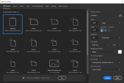
Create a new document with a width of 1800 pixels and a height of 1200 pixels at 300 pixel/inch. If we have 300 pixels in one inch we would have 1800 pixels in the 6 inch wide and 1200 pixels in the 4 inch high document we want to create. 300 px/in is arbitrary. For instance it could be 240 px/in or 720 px/in but the total number of pixels in this case is always 6 x px/in and 4 x px/in. PS Elements will have something similar to this. See the ‘New Document’ image:

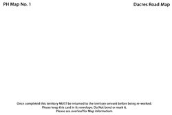
In this new document I created a new layer by clicking on the text tool. I did this 3 separate occasions . Each layer is editable and movable although I believe the bottom text layer will remain the same for you. I edited these layers and used 12 pt and 9 pt text but it can be resized by using handles also. (see below for more on handles and resizing)
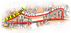
I then opened ‘map 1.jpg’ as a separate document and dragged its single layer over to the 4x6 document. The resultant image was too small but I can change this by:
Selecting the map layer and using CTRL + T (Control key and T key simultaneously) to Transform that layer. 8 handles will appear. I can ‘grab’ a corner handle while holding down the ‘Shift’ key ( that keeps the same proportions/aspect ration) when I drag it out to make it bigger. ‘Grabbing’ it in the middle allows me to move the map. See 2nd image I attached:

Save as PSD format. This preserves the layers and keeps the text editable and not as a bitmap. Saving as a JPEG/JPG flattens everything into one all bitmap layer. I would do both.
At this point I have 4 layers, 3 of which are editable text layers. To make a new 4x6 map document, open the saved PSD file, edit text as needed and delete the current bitmap map image layer and replace with a new map and resize. Save as…with a different name.


