What's new
Photoshop Gurus Forum

Welcome to Photoshop Gurus forum. Register a free account today to become a member! It's completely free. Once signed in, you'll enjoy an ad-free experience and be able to participate on this site by adding your own topics and posts, as well as connect with other members through your own private inbox!

Adjustment strength affected by clipping mask


jhenkinson

New Member
Messages
4
Likes
0
Hi all

Can anyone help me with this question please?

I'm a casual user of Photoshop, being decent at some basic editing. But I'm trying out some compositing and light manipulation effect for fun. Image compositing really get me into a creative mood. But I'm running into a problem with an effect I'm trying out.

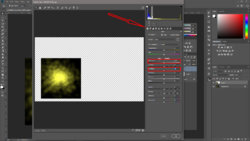
Here is an example:
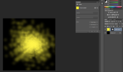
I'm trying to add artificial lighting into the image. Most of the process of adding the effect has been fairly ok, but I can't seem to get a decent increase in its brightness, luminance or the spread of its glow. I brought a level adjustment layer into it and clipped to the artificial light layer - the effect didn't increase all that much:
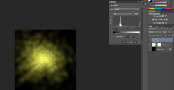
1547204259857.png

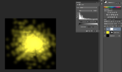
But if I take away the clipping mask, it seems to have the result I wanted:
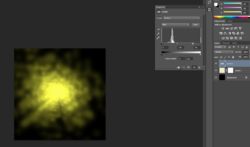
1547204357672.png

Merging the light object with the adjustment without clipping mask didn't help, it just produces the same result as if there is clipping mask anyway.

Of course I can include both layers in the image without clipping then just mask the level adjustment layer and reveal its effect just over the area with the light. But for one, it's more fiddly than clipping mask and 2, even with the mask on the level adjustment layer, at its core without clipping mask it's still a global effect so it would still affect other layers where it is revealed from the mask anyway.

Am I doing this correctly? Or is there another way to up the intensity of this light?
 
You could make a 'snapshot' of the layers (shift+ctrl+alt+E)(this is not merging the layers but adding a new layer as if they were merged) and if this isn't working you could use the Camera Raw filter and go to the first tab and experiment with the exposure or highlights.

Untitled-1.jpg
 
Thanks, doing the snapshot helps (it gives the intended result as far as the light goes), but that means you have the background along with your lighting as well. And since there are several shades of yellow and black because of the light effect, so it's a bit hard to get rid of the background with select colour range. (which is why I decided against merging - so similar reason with snapshot I think)

I tried the Camera Raw Filter as well, Exposure washes out the yellow (makes it more white) rather than intensifying the brightness of yellow, highlight in this case doesn't seem to do much.

I wonder if the reason why the global level adjustment works and the clipped version doesn't is because the global one picked up on deeper black level , which allows a bigger range of adjustment or not. It's a theory. If that is the case, I may just put a black dot somewhere on the scene so I can delete it out easier rather than a whole black background.
 
I wonder if the reason why the global level adjustment works and the clipped version doesn't is because the global one picked up on deeper black level , which allows a bigger range of adjustment or not. It's a theory. If that is the case, I may just put a black dot somewhere on the scene so I can delete it out easier rather than a whole black background.

Clipping with a non-identical result on a black or white background is an old PS issue. I've encoutered it myself and do not have a solution for it.

But maintaining the existing layers with the desired result should not be a problem since the final result will be 'saved as' (Jpeg/PNG ect) and the PSD file saved as PSD.
 
HI Jhenkinson
Its the transparency on you yellow lighting Layer that is getting in the way. I could provide details about it if desired.
Here is the workaround on the lighting mask Layer
1) Delete the existing white Layer Mask
2) Convert transparency of Layer to a Layer Mask vis Layer > Layer Mask> From Transparency
3) With Layer mask adjusted use Layer > Adjustments> Levels (or Curves) and adjust as desired.

Give that a try and bet that will help
Just a suggestions to try
John Wheeler
 
Thanks thebestcpu, that's a new trick that I didn't know.

Regarding the result though, it doesn't seem to provide the desired effect:

Here's the layer after creating layer mask from transparency
1547461366846.png

Adding in a level adjustment layer (global) - the desired blooming and intensifying can be seen
1547461516256.png

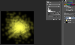
And if I now applying a clipping mask, the effect is noticeably weaker straightaway, just some brightening visible, almost no blooming

1547462223825.png

I'll continue to play around with this a bit more, there may be another way.

Regardless, really appreciate your suggestion, it's a cool technique to create a mask.
 
Hi Jhenkinson

I did not communicate well in my last post. So I will clarify and also give you a second way to achieve your results.

Once you have creatied the Layer Mask you a) select that mask by clicking it in the Layer Panel and then b) adjust the grayscale density of the Layer Mask by using the command Layers > Adjustments > Levels or Layers > Adjustments > Curves. c) Note, no additional Adjustment Layer is needed whether clipped or not.

OK so here is another way that will also work.

Once you create your lighting Layer (the yellow patter), duplicate that Layer once, twice, or ~ three times. This will reduce the transparency and increase the lighting impact. You can find tune this by adjusting the opacity of any of those Layers if it is too much. Again, no additional adjustment Layer Clipped or not is needed.

Hope the additional information is helpful. Sorry for not providing images as I have bee a bit tight on time.
John Wheeler
 
Thanks John, really appreciate the clarification. That definitely helped. Although I have to admit probably your other suggestion (just duplicating the layer) will turn out to be the most effective solution for a whole lot less work (just goes to show sometimes the simplest solution may well be the best).
 
Thanks John, really appreciate the clarification. That definitely helped. Although I have to admit probably your other suggestion (just duplicating the layer) will turn out to be the most effective solution for a whole lot less work (just goes to show sometimes the simplest solution may well be the best).

I agree :)
John Wheeler
 

Back
Top