Photoshop Tutorials
Post-It Stick-Ups

This effect is fairly simple, but you should know here now that I use the Paths tool to create the paper part of this effect. Mainly because it's easier to create the 'bent corner' characteristic sometimes seen with these stickup papers; and a lot of other types of paper effects. So you'll have to be just a bit familiar with using Paths for this, because I won't be explaining in any great detail how to use them in this example. The PS Help files can show you most, if not all of what you'll need to know, should you not be familiar with the tool.
To make this a bit easier on everyone, I'm providing my source PSD file for this effect. In this way, you can examine each layer I've used and learn to understand how I went about creating the effect from scratch.The file is 608KB in size.
If anyone has problems downloading or viewing this file please let me know.
| Step 1 |
Attributes: 250x200 pixels / RGB / White Background.
You can also have my source PSD file open at the same time for comparison while going through the steps.
| Step 2 |
I used this color: R/255 G/255 B/0. Leave the selection on.
| Step 3 |
| Step 4 |
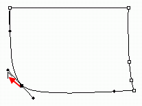
Click on, and hold your mouse down on the Path tool in the tools palette (also known as the Pen tool). From the secondary tool menu that slides out, choose the solid pointer icon (this is the 'Direct Selection' tool). With this tool, click once anywhere on the path, then once on the bottom left corner node on the path; that selects, or activates just that node. Press your right arrow key 17 times; this moves that node over 17 pixels. Then press your up arrow key 9 times. Now open the Path tool's secondary tool menu again and choose the icon that looks like an outlined triangle, with the bottom line missing (the 'Convert Point' tool).
 Using this tool, click and hold the tool down on that bent corner's node. While holding the mouse down, drag upward and left in a diagonal direction; roughly 45 degrees. You should see 2 long handles appear.
 Note: Sometimes these node handles will appear reversed when you first create and pull them (bent the wrong way, or twisted). If this happens, just drag the handle you're holding over to the other side of the node.
Continue dragging the handle upward and left until the corner of the path starts to look slightly rounded. The rounding of this corner should look fairly subtle. The effect is that the paper is curling slightly upward and toward us. If you drag too far up you'll know it, because the left side of the paper (the path) will start to look like it's bulging, and we don't want that.
When you've got that corner done, click on the right bottom corner node. Now press your right arrow key 8 times, and your up arrow key 3 times. We need to now make the right side of the paper bend inward just a bit. Use the 'Convert Point' tool again for this (should be the current tool you're using). Repeat the same steps as above to create the node handles on this corner, by dragging the tool upward and very slightly to the right. For the right hand side, just create a gentle inward curve for this line of the path.
There, now our general paper shape should be ready to fill. Click now on the small arrow at the top right of the Paths palette. From the menu choose 'Fill Sub Path', and click the OK button in the dialog box that comes up. Then click the option menu arrow again and choose 'Turn Off Path'. Now return to the Layers palette and create a New Layer (shift+ctrl+n), and move this layer below the 'paper' layer.
Save your file now!
| Step 5 |
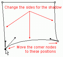
 Now use the same Path tools as you did for the paper, and alter the shadow path's shape to match the shadow shape you see in my sample PSD file; or the sample image here on the right. Then apply 'Fill Sub path...' with black. And nudge this layer down 1 pixel.
Make sure if you apply blurring to the shadow that you don't use too much. A good amount would be Gaussian Blur = 1 to 1.5 pixels maximum. Or better yet, just apply the 'Blur More' command. And turn down the shadow's Opacity too; I used 40-50% opacity. This will make it appear that there's a lot of ambient light in the room.
I won't go into any further details for this part here, because if you're NOT familiar with this tool, then it'll give you a chance to learn more about how to use it. And also, because learning to use this tool is not the objective of this tutorial.
But don't worry, it's not as scary as it looks. Just play around with it a little. And read the HELP! files to learn what each of the Pen tools is for.
| Step 6 |
 you're not familiar with these, go here to learn more about them.
 Tips for creating the highlights:
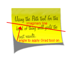
- The trick to creating a correct lighting effect for this type of image, lies primarily in where you start and end the "white to transparent" gradient. And the correct place to stop applying the grad, is where the paper stops bending inward. Starting from the bent corner, look along the edges of your paper, left & right of the bent corner, and when the paper starts going straight, that's where you must stop the gradient tool. The point you start the tool is of course at the tip of the bent corner.
- Sometimes it can be hard to see the proper angle for the grad tool though, between 2 points along the paper's edge. In this case, you need to draw an imaginary line from the end points, along the left edge of the paper, over to the end point on the right or bottom edge, then drag the grad tool straight outward from it's origin to a point that intersects the middle of the imaginary line that's connecting the edges.
| Step 7 |
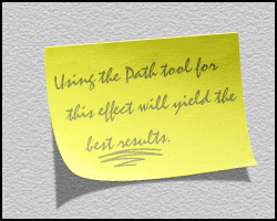
Note: If you do not have the same font installed as the one I used in my source PSD file, then the writing on the paper will very likely NOT look the same as the header image above. That's ok, choose your own 'hand writing' style of font from the ones you have installed.
T I P S:
- Just a couple of things here...
If you want to add a bright edge thickness to your paper like I did, (again, very subtle, but adds to the realism), just Duplicate the 'paper' layer and move the duplicate copy below the paper layer. Ctrl-click the layer to select the shape, and fill the selection with a medium gray. Set this layer's Blend Mode to Exclusion. Then Deselect (Ctrl+D), and use your arrow keys to nudge this layer 1 pixel right, and 1 pixel down. Finally, set the 'paper' layer's Blend Mode to Hard Light. If you see a dark line along the right and bottom of the paper, make sure the 'paper copy' layer is activated, and use the Eraser tool to remove those edges. - And in case you're wondering...
You can create a stucco wall effect on a New Layer using the Filter/Texture/Texturizer filter. Move the layer down in the palette so it's right above the Background layer. Start by filling the entire layer with a medium gray. Then apply the filter. To make the effect more subtle, set the layer's Blend Mode to Multiply, and turn down the Opacity to about 30-40%. - And finally...
Don't forget to save your document frequently!
And that about does it for this effect. I hope everyone enjoys it!
Onward'n'Upward!
Copyright © Mark Anthony Larmand
For help, advice, tips and tricks, challenges, feel free to visit our


