Photoshop Tutorials
Circular Text and Text on a Path
PAGE 1 / 2

NOTE: This tutorial was designed for users of Photoshop 6 or newer.
The filter needed for this specific method of this effect is not contained in older versions.
Note to Mac users: The PC key Ctrl = the Mac key Cmd. And the PC key Alt = the Mac key Option.
This specific method of creating this effect is very simple, and because of that, there won't be a whole lot of detail to cover. However... there will be 2 separate parts to this tutorial.
Ok lets start by creating a New Document. The dimensions will be equal: 350x350 pixels (although this is NOT essential), and with a White Background.
| Step 1 |
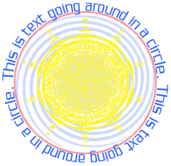
Choose the Type tool, and create a short sentence -- 6 or 7 words should work fine for our example.
| Step 2 |
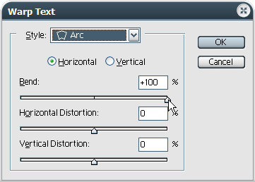
 Look within the Options Bar over on the right-hand side.
There's an icon of the letter T with a curved line under it.
1) In the 'Warp Text' settings window, adjust the bottom slider - Vertical Distortion - to the left until you get a -5 to -7 setting; or until the text looks like it's back to its proportional height. Or, you can simply adjust this setting to suit your own tastes; using either a negative or positive setting. Try it both ways to see the effect it creates.
2) Click OK to apply the Warp Text filter. Then go into the settings dialog for the Character and Paragraph options. Under the Window menu choose Character. Or just click this icon on the Options Bar
| Step 3 |
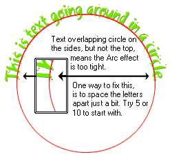
The Character Spacing (Tracking) setting is one method. Change that number and see how it effects your text.
And also, you can change the Horizontal Scale setting to make your circle wider or narrower -- the setting with the horizontal arrow underneath the letter T.
So if you're trying to make your text go around a circle at a specific diameter, then these are the settings to tweak to get that done.
T I P I've found that adjusting the Horizontal Scale< works best for this. Specifically if you do not want your letters to be spaced apart a lot.
Here is a graphic example of what is outlined in this step:

| Step 4 |
But hey!?... Don't be afraid to try out some of the other character settings too, to find out what they can do for you.
And it should also be noted at this time that if all you need is a half-circle text effect, then don't forget that you do not need to settle with the text being along the top... rotating your entire text layer can create some interesting and different effects within your image too.
PAGE 1 / 2
Copyright © Mark Anthony Larmand


