Photoshop Tutorials
Creating a Mercator (wire frame sphere)
| Step 10 |
 Press Ctrl+Shift+I to Invert the selection. Then press your Delete key. Then Ctrl+D to Deselect. And one last thing now... apply the 'Spherize' filter one more time. This will increase the spherical look of the lines, and increase the size of the sphere as well -- which is why we scaled the sphere down in Step 8. This is the real secret move to making this effect look good & clean.
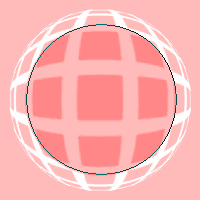
 And the last step to making this effect complete is to spherize just the very center of the line grid -- this will improve the 'mercator projection' of the lines. So create a circular selection like the one shown in the example image -- above right. Use the Elliptical selection tool, and hold the ALT & Shift keys down; click as close to the exact middle of the sphere as you can, and drag your mouse outward. Take notice that you only want to select the radius of 3 squares, starting from the center outward. Once selected, Feather the selection by 10 pixels (SELECT>Feather). And then apply the Spherize filter with a setting of only 10; and using the 'Normal' mode. Then you can Deselect.
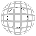
Your image should now look a lot like the one at the top of this page.
And if you'd like your sphere to tilt, just use the Rotate function under the 'EDIT/Transform' menu. Try plus or minus 30 degrees. Voila! A Mercator!
T I P S
Clean Up
If the lines look a bit fuzzy, from the rescaling step, use the 'Unsharp Mask' filter on the sphere to sharpen the lines. Don't overdo this though. Try using 100% 0.5 0 for the settings.
 If that isn't enough to clean up the line edges, or if sharpening makes the outer edges look really jagged or broken, then you'll need to try a more precise method. What we don't want to do is apply sharpening to the lines around the outer edge, because they will only become jagged and broken. So we need to clean up only the inner area of lines. And this is how we do that...
Don't apply sharpening, but instead, just Ctrl-click the mercator layer to create a selection of it. Then open the Channels palette and click on the "Save selection as channel" button -- the solid square with the white circle in it; (2nd button from the left). Then click on that Channel to make it active, and Deselect.
Press the Q key to enter 'Quick Mask' mode.
Make sure your Foreground color is set to black (tap the D key), and click the brush once. Now press Ctrl+I to invert the mask. Then apply a 10 pixel Gaussian Blur to the Quick Mask. Press the Q key again and you should see just a circular selection, within the center of the mercator.
And now, press Ctrl+L to open the Levels filter. Set the black (left) slider to 35 and the white (right) slider to 215. These numbers can vary, so in the end, use your own eyes to tell you if you need to increase or decrease their values; leave the center slider alone though. Basically, you don't want your lines jagged looking.
Do you understand what just happened?
Why we used Quick Mask and blurred it... if you're curious as to what purpose this served, create a new temporary layer and under the SELECT menu choose "Reselect". Then fill this selection with black, and Deselect. I call this a 'fading selection'. And it allowed us to apply a filter to our image, and have the effects of the filter 'fade out' near the edges of the selection -- just like how the pixels fade out at the outer edge. If you're still confused, go to the Forum and bring up this subject in a new thread.
| Alternative |
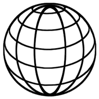
 This image is somewhat different than the previous style. But this style is also very popular -- especially in company logos. It's going to take a bit more to create this effect compared to the first one, but once you're familiar with these steps, it won't take you long to repeat the effect whenever you need it. Or, you can also create an Action to do a lot of the grunt work for you -- an Action will NOT be able to create this effect completely though. But it can do most of it.
Note to mac users: The PC key Ctrl = the Mac key Cmd. And the PC key Alt = the Mac key Option.
Don't forget to SAVE after every 2 or 3 steps!
| Step 1 |
| Step 2 |
Then create a circular selection, that fills most of the canvas area.
Hold down the ALT & SHIFT keys to create a perfect circle, that draws from the center outward.
| Step 3 |
 Apply a white-to-black Radial Gradient to the selection. Hold the Shift key down, and start the grad tool at the very top center of the circle, and drag it to the very bottom center of it. Name this layer 'grad sphere'. Leave the selection going.
| Step 4 |
 Add an Adjustment Layer right above the 'grad sphere' layer (click the split black and white circle image at the bottom of the Layers palette). Choose the "Posterize" filter for this adjustment layer. Set the filter to 6. Notice what happens? We get 6 individually shaded sections -- which will end up being our wire frame rings. If you want more or less, then use a number matching the amount of rings you want. For this example though, I'd like you to use 6 ok.
Now we want to center our gradient sphere on the canvas. Activate the 'grad sphere' layer by clicking on it. Then press Ctrl+A, Ctrl+X, then Ctrl+V.
Ctrl-click on the 'grad sphere' layer again to reselect it
| Step 5 |
If your selection is no longer active, Ctrl-click on the 'grad sphere' layer again to reselect it.
| Step 6 |
Click on the 'grad sphere' layer to make it the active layer. Apply the "Spherize" filter (FILTER>Distort>Spherize) using the 'Normal' mode, and set to 100% strength -- watch the sphere as you apply this filter. Did you notice how applying this filter made the gray sections of the sphere flatter, and gave them a better, proper oval shape for our effect? If you did not know to apply this filter to your gradient, your globe's lines would be too steep, and not look correctly shaped.
Leave the selection going.
| Step 7 |
| Step 8 |
These filters are used to help smooth out the lines dividing the different shades -- but unfortunately they can't smooth them extremely perfect. Which is one of the drawbacks of trying to do this effect with just filters. Actually the problem filter here is the 'Posterize' filter, not these other 2. But don't worry, we'll get the lines even cleaner by applying one more filter (PS7 only). (Photoshop 6 and earlier users will need to use 2 filters for this
| Step 9 |
 Now open the FILTER menu and choose Stylize>Glowing Edges. Use the settings 5/20/15. And now for the secret ingredient that will smooth our lines out even more. Below are 2 methods -- one for PS7 and one for PS6 and earlier.
PS7+ Users: Under the 'FILTER>Stylize' menu, choose 'Diffuse>Anisotropic'. Apply it once, then press Ctrl+F 4 times -- this applies the filter a total of 5 times.
And now, press Ctrl+L to open the Levels filter. Drag the right slider left to 128. Then start dragging the left slider right until your lines get cleaner, harder edges -- try 55. Don't go too far though or the lines will look jagged. If that happens, then move the left slider back a bit. Click OK to apply.
PS6 & Earlier Users: Under the FILTER>Blur menu, choose 'Blur More'. Apply it once, then press Ctrl+F 4 times -- this applies the filter a total of 5 times.
And now, press Ctrl+L to open the Levels filter. Drag the right slider left to 128. Then start dragging the left slider right until your lines get cleaner, harder edges -- try 55. Don't go too far though or the lines will look jagged. If that happens, then move the left slider back a bit. Click OK to apply.
Now, redo this procedure one more time; starting from the 'Blur More' filter. This should smooth out the lines really well.
| Step 10 |
Now you'll need to 'hide' the bottom 3 layers -- the original 'grad sphere' layer, and the 2 adjustment layers. Click on their 'eye' icons to hide those layers.
You should now end up seeing a negative version of what your channel looks like. Name this layer 'base sphere'. If your lines are a little uneven, then run the 'Diffuse>Anisotropic' filter again (PS7+ only), and apply the Unsharp Mask set to 250% / 0.5 / 0. If they're just a little fuzzy, then only apply the Unsharp Mask filter set to 100% / 0.5 / 0.
PAGE 1 / 2 / 3
Copyright © Mark Anthony Larmand


