What's new
Photoshop Gurus Forum

Welcome to Photoshop Gurus forum. Register a free account today to become a member! It's completely free. Once signed in, you'll enjoy an ad-free experience and be able to participate on this site by adding your own topics and posts, as well as connect with other members through your own private inbox!

Need Inspection Of Spanish Club Flyer ect work


bahamafotoshoppe

Well-Known Member
Messages
131
Likes
30
Didn't make them to flashy. I recently got elected presidente del club espanola . ( Spanish club president ) So Now i have to do things and stuff. I was doing some stuff for a flyer and the graphics for our badges just wanted you all to see them. tell; me show me teach me how to fix what you think is wrong.

Membercopy.png

Spanishclublogo.png

spanishclubflyer.png

found the following on shutter stock and edited it . The shirt was green and the dress was dark red. there was no hat. I was doing this 4 fun
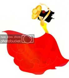
spanishdancer.jpg
 
I think on the fist one, the green is too bright, and on the second one there shoud be some kind of shadow or bevel or something around the different parts, it´s look a bit flat. I also can´t see any shirt or dress, I think maybe you missed something in posting it. :)
 
Estoy de acuerdo con VAFANN sobre lo que parece plana, tambien creo que 3 fuentes DIF son mucho mas y en los dos que usted hizo con 4 dif. Fuentes .... manera de la manera a mucho. en mi opinión, es una distracción

(i do agree with Vvafan about how it seems flat also i think 3 dif fonts are a lil much and in the 2 one you did has 4 dif. fonts way to much. it is distracting in my opinion) the translation for all you eng. speakers out there
 
Last edited:
Maybe put a stroke around the lettering, a very thin line maybe...
 
Try to stay away from using these bevel fonts because it brings a very amateurish impression.
 
Last edited:
why not try it in a opposing colour to the theme colours? The stroke colour i mean.
 
What colour exactly ? is a green to bright ?

Well, green might not generally be too bright, but the greens and reds and yellows you are using are very hard on the eyes, maybe your screen is not calibrated or something? It might be that you don´t see the colors the same on your screen as others do on theirs. :)
 
I do believe so,. When i put picture on the computer at school they are brighter than my computer here.

Ok, that might be the problem then. I have saved a page somewhere among my million bookmarks, that helps with calibrating your monitor. I will go and see if I can find it for you. :)
 
Sorry, I looked everywhere and I couldn´t find the link, but if you google Monitor calibration I would suppose that you can find something. The one I found before was an online thing that you could visually calibrate your monitor with. :)
 

Back
Top